Registering and updating content types
Release date: 11th April 2018
In this release we've added a new section to the Dynamic Content masthead: development. As its name suggests, from the development tab you'll be able to access features intended for developers, starting in this release with registering and updating content types.
As explained on the integration section, content types are the templates for content items, defining the type of content to be created, including its structure and validation rules. Content types are stored externally to Dynamic Content, on web based services such as AWS, and must be registered with a hub before they can be used to create content. In this release we've introduced a user interface to make it easier to register and configure content types, including providing support for out of the box icons and content library cards.
Registering a content typeLink copied!
In this section we'll walk you through registering a content type using the UI.
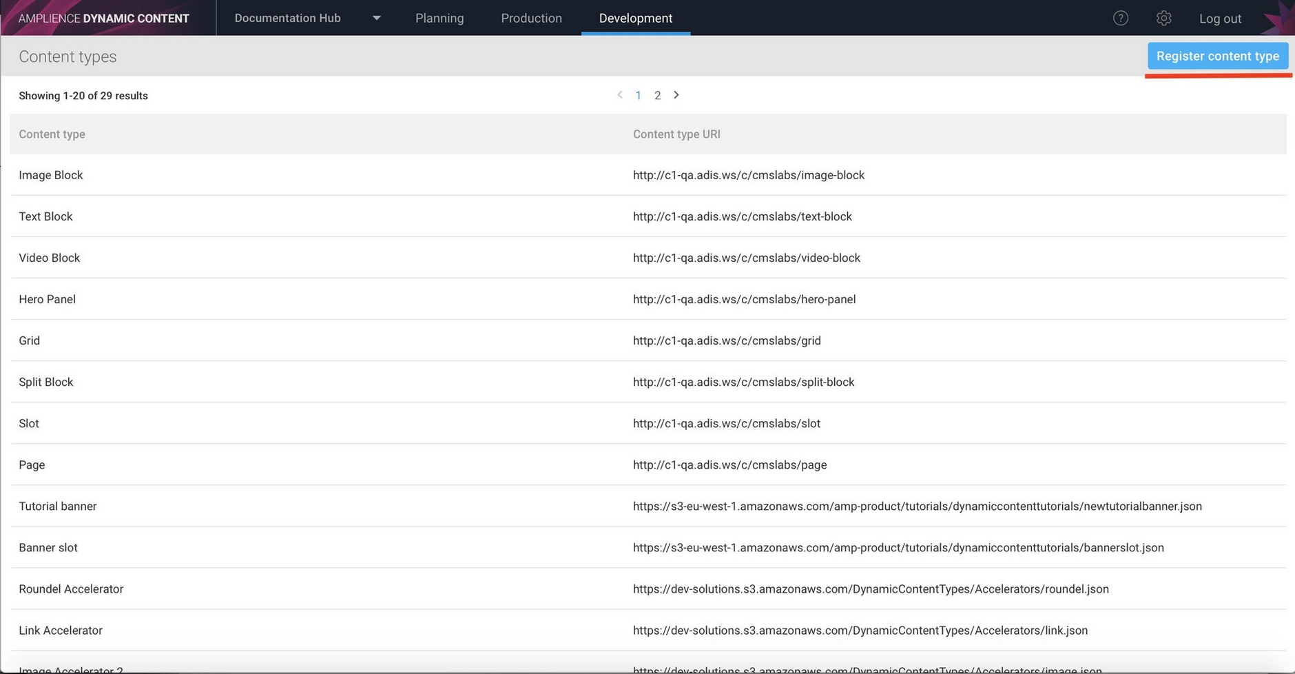
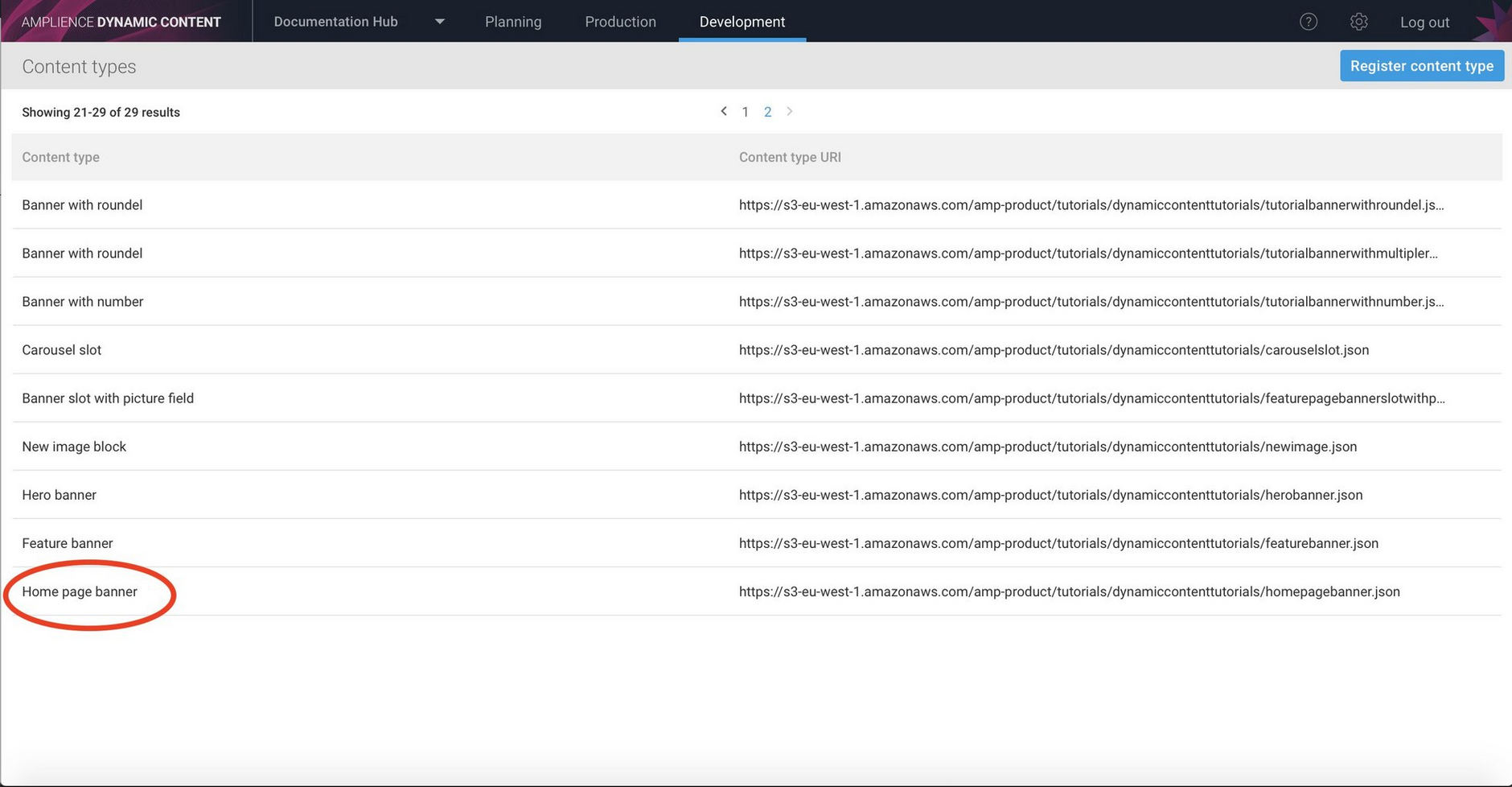
Select the development tab at the top of the Dynamic Content window. A list of content types registered to this hub will be displayed, with their label and their URL. To register a new content type click the "Register content type button".
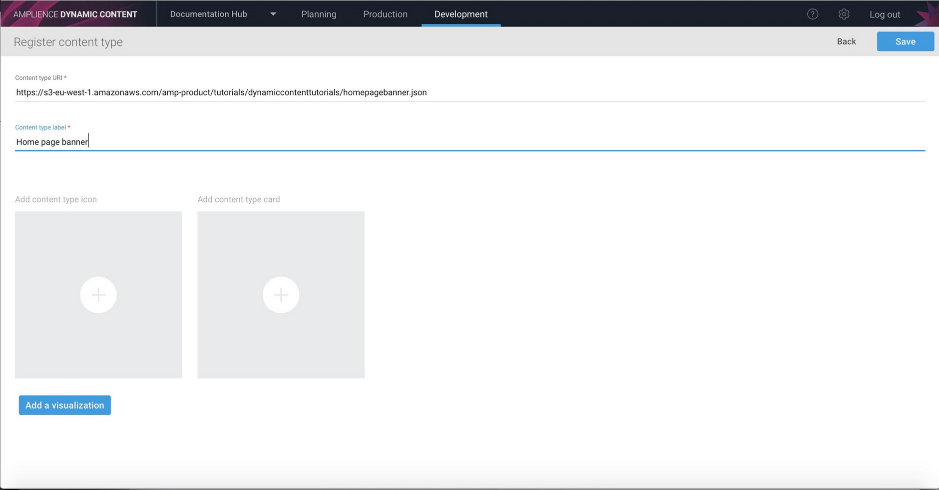
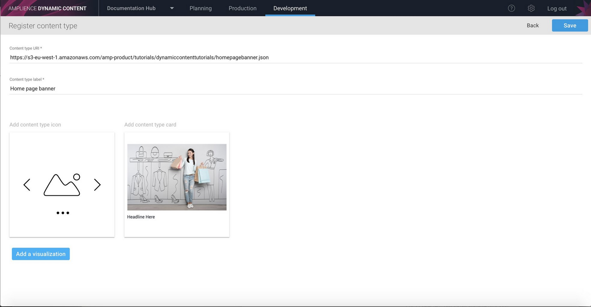
The register content type window is displayed. In this example we're adding a home page banner content type.
Enter the URL where the content type is stored and provide a label- this is used in the content type window in the production view.
Adding a content type iconLink copied!
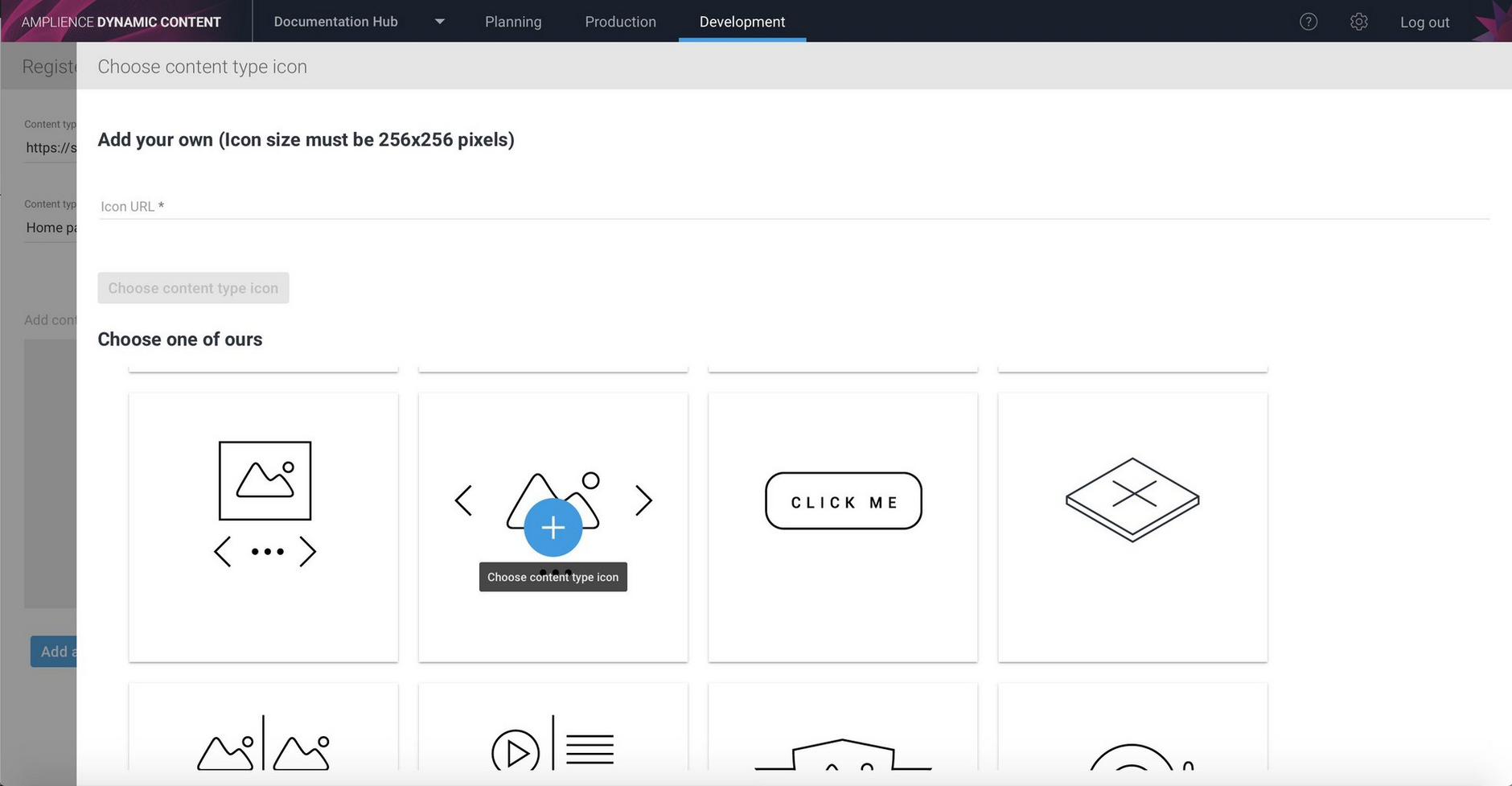
You can add an icon to a content type by providing the URL to a 256x256 pixel image or choosing one of the standard icons. In this case we'll choose a simple picture icon.
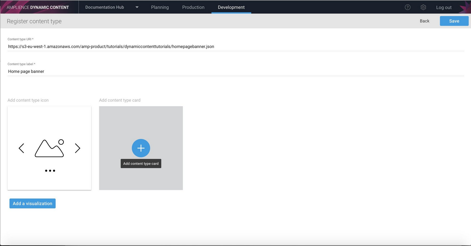
Once you choose an icon, you'll be returned to the register content type window.
Next we'll add a content card. As explained in content library cards, a card provides a graphical representation of a piece of content, making it easier to identify in the content library.
Mapping content type properties to a cardLink copied!
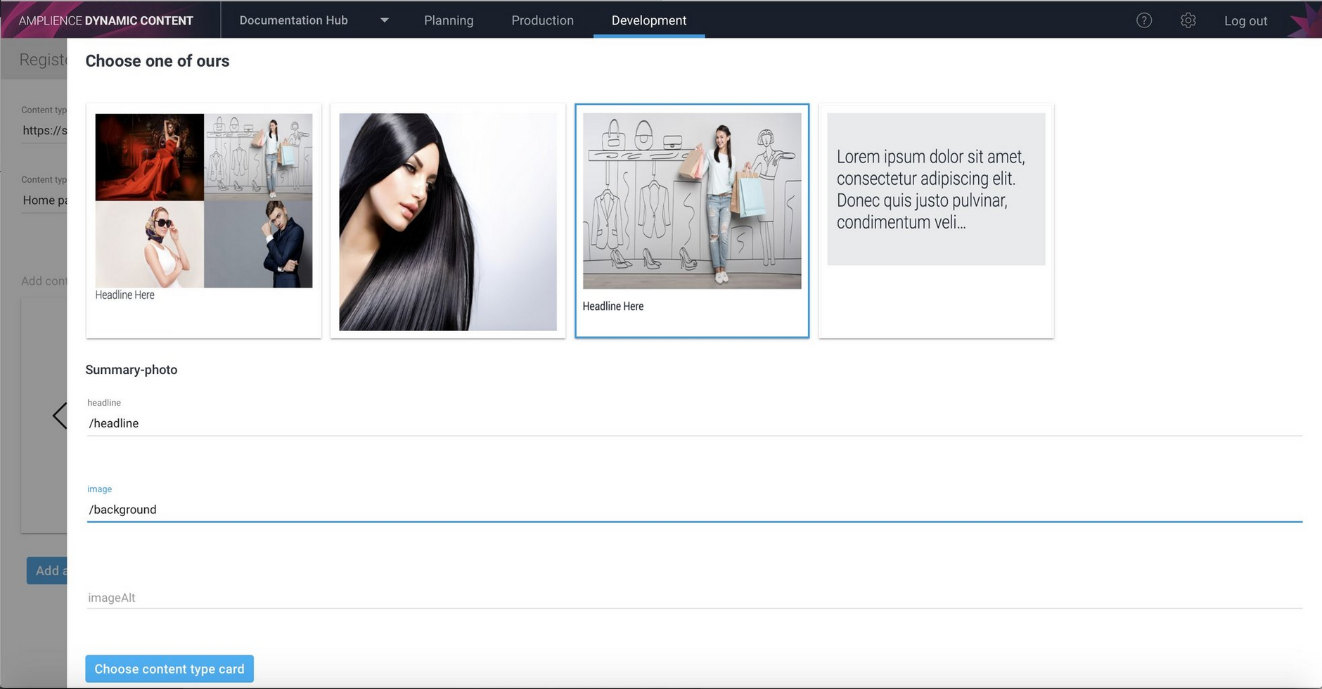
You can provide the URL to your own custom card or choose from one of our out of the box cards, each providing a different way of representing your content. For this example we'll use the summary photo card. This will display an image with some text underneath.
Each card includes a number of configurable fields that determine how the card content should be displayed. You will map the chosen properties in your content type to the fields displayed on the content card.
For example, the banner type includes properties named "headline" and "background". We want the value of the headline property to be displayed on the card, so we enter "/headline" in the headline field and "/background" for the image.
When content of this type is shown in the content library, the background image will be displayed with the headline text underneath.
When your chosen card is configured, click the "Choose content type card" button to return to the main screen.
Adding a visualizationLink copied!
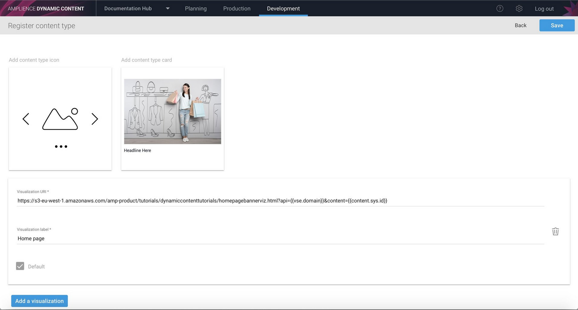
If you want to provide a visualization for the content type, click the "Add a visualization button" and enter the templated visualization URI in the field provided. Note that you must provide the complete URI, including all the templated variables. Give the visualization a label.
If you want to add an additional visualization, click the "Add a visualization" button again.
Click Save to register the content type with the hub.
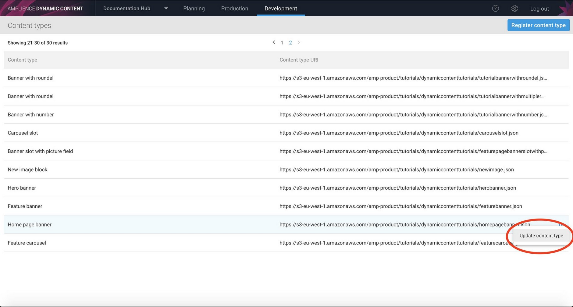
Once registered with the hub, the content type appears in the list. In the image below, the newly added home page banner is highlighted.
::: info Enabling content types
Note that once registered on a hub, content types must be enabled on each repository in which you want to create content of that type. Your customer success manager will be able provide you with more details.
:::
Viewing content in the content libraryLink copied!
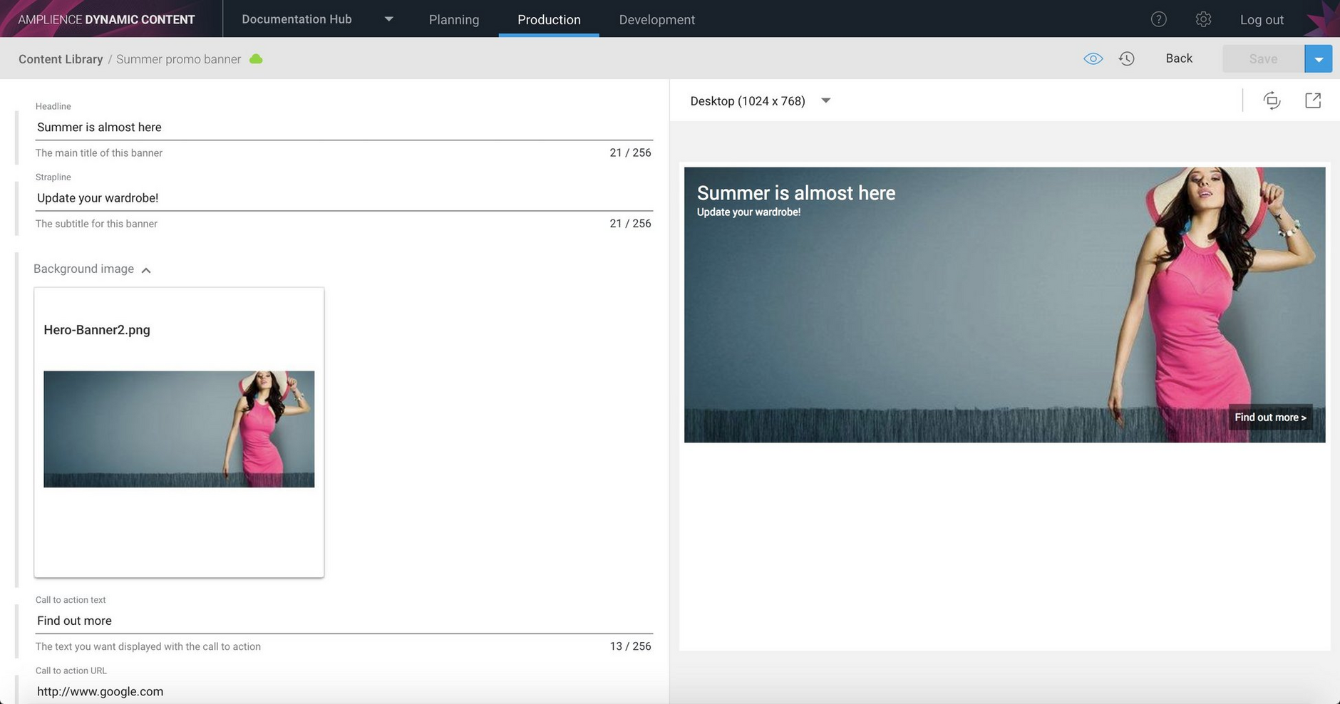
When the content type has been enabled on a repository, you can start using it to create content. The example below shows content created from the home page banner type, consisting of an image and some headline text: "Summer is almost here".
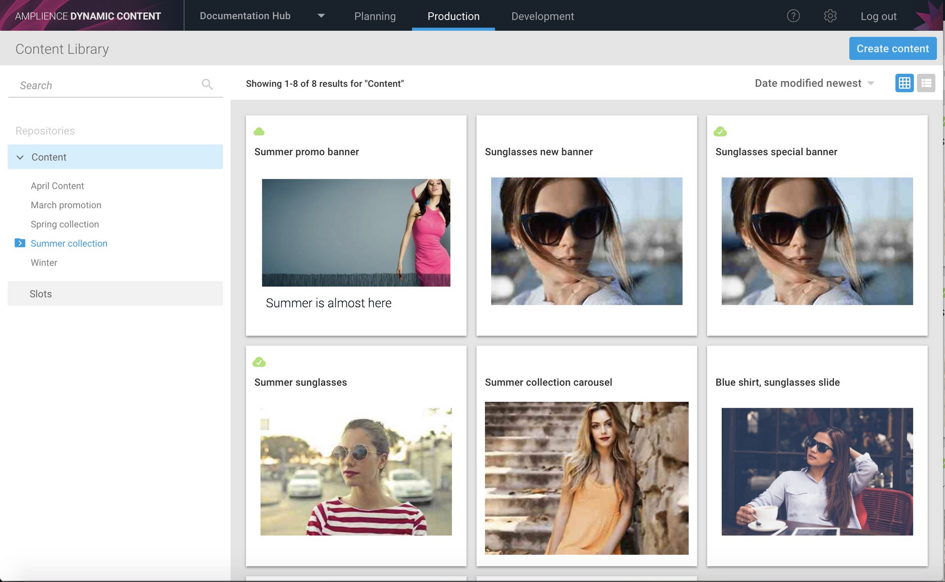
The saved content appears in the content library. Notice that the image appears with the headline text underneath. That's how we configured the summary photo card when the content type was registered.
Using cards with nested contentLink copied!
You can configure are out of the box cards to work with nested content, such as a carousel that contains one or more carousel slides.
You'll need to specify the mapping for each field using the JSON Pointer standard. This allows you to identify a specific value within JSON content, such as an image within an array.
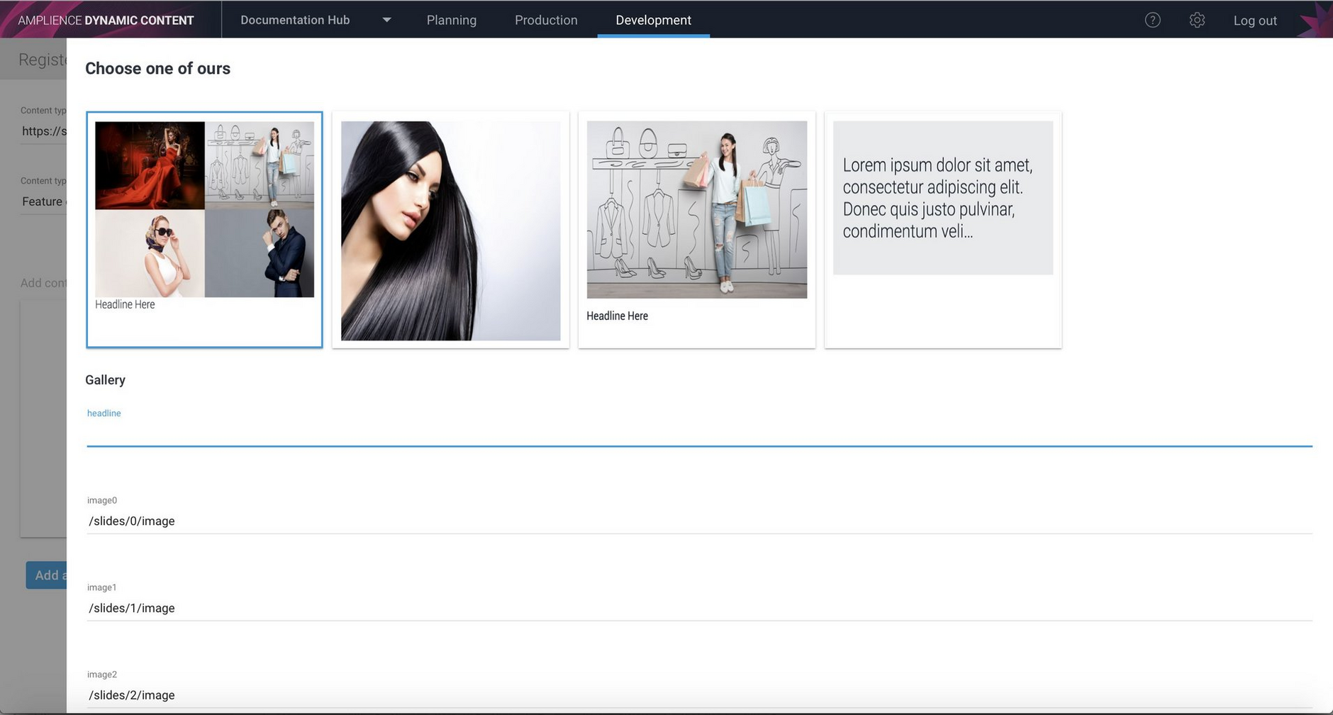
In this example we're registering the carousel content type. In the carousel the "slides" property contains an array of carousel slides and each slide contains an "image" property. The gallery card can display up to 4 images in a grid, so we want to use the it to display the image of each of the slides. We specify "/slides/0/image" for image0 and so on up to image3.
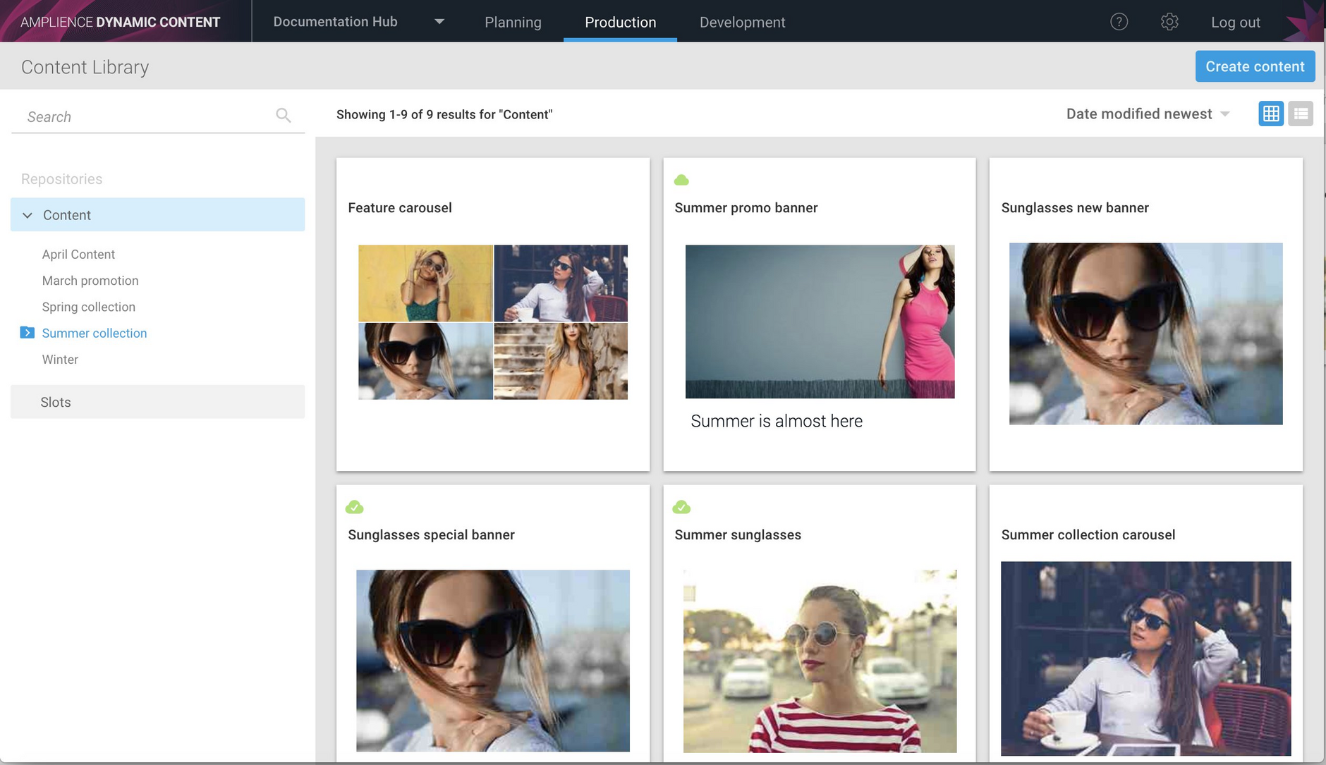
Here's an example of a carousel displayed in the content library. It contains 4 carousel slides and the image of each slide is contained in the grid shown on the card in the content library.
Updating a content typeLink copied!
Sometimes you'll need to make changes to a content type after it's been registered on a hub, particularly in the early stages of a project. For example, you may have changed property labels, validation rules or added items. Because the content type is not stored within Dynamic Content, if you make a change, you'll need to update the content type in the hub.
To update a content type, select the development tab, choose the content type from the list and select "Update content type" from the contextual menu on the right hand side. You'll see a message indicating that the content type is updated.
In this release we've improved the way that content is displayed in the content form when a property type has been changed, but particular care should still be taken when updating content types, since any changes may effect the editing of existing content.
