Dynamic Content- Visualization scaling
Release date: 17th February 2021
In this release we provide an overview of a recently released feature that lets you choose how your visualizations are displayed in the content form. You now have the option to turn off scaling, so that the visualization can make use of the full area of the visualization window.
The visualization scale optionLink copied!
Visualizations are a great way of previewing how a piece of content will appear when it's displayed on your site or in an app. Developers write visualization apps that display a preview of the content and ensure that this preview is as close as possible to the final site. You can also view the visualization at different device sizes and in portrait or landscape orientation.
However, if a piece of content is larger than the selected device size, it will be scaled to fit, which may result in font and image aliasing and display a less accurate representation of how the content will appear on your site. With the new scale option you can use the full size of the visualization window and let your visualization app take care of responsively displaying the content.
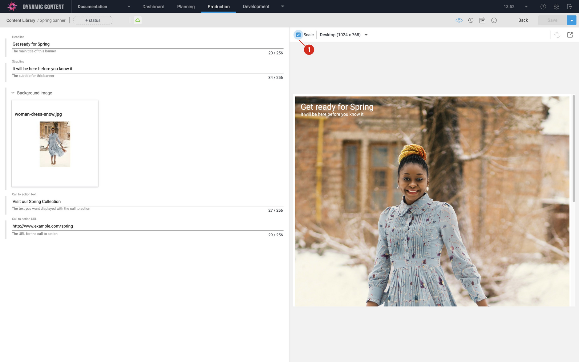
When the scale checkbox is selected (1 in the image below), then the previous behaviour is maintained and you can choose a device size from the menu and click the orientation icon to switch between portrait and landscape. The content will be scaled to fit into the chosen device size.
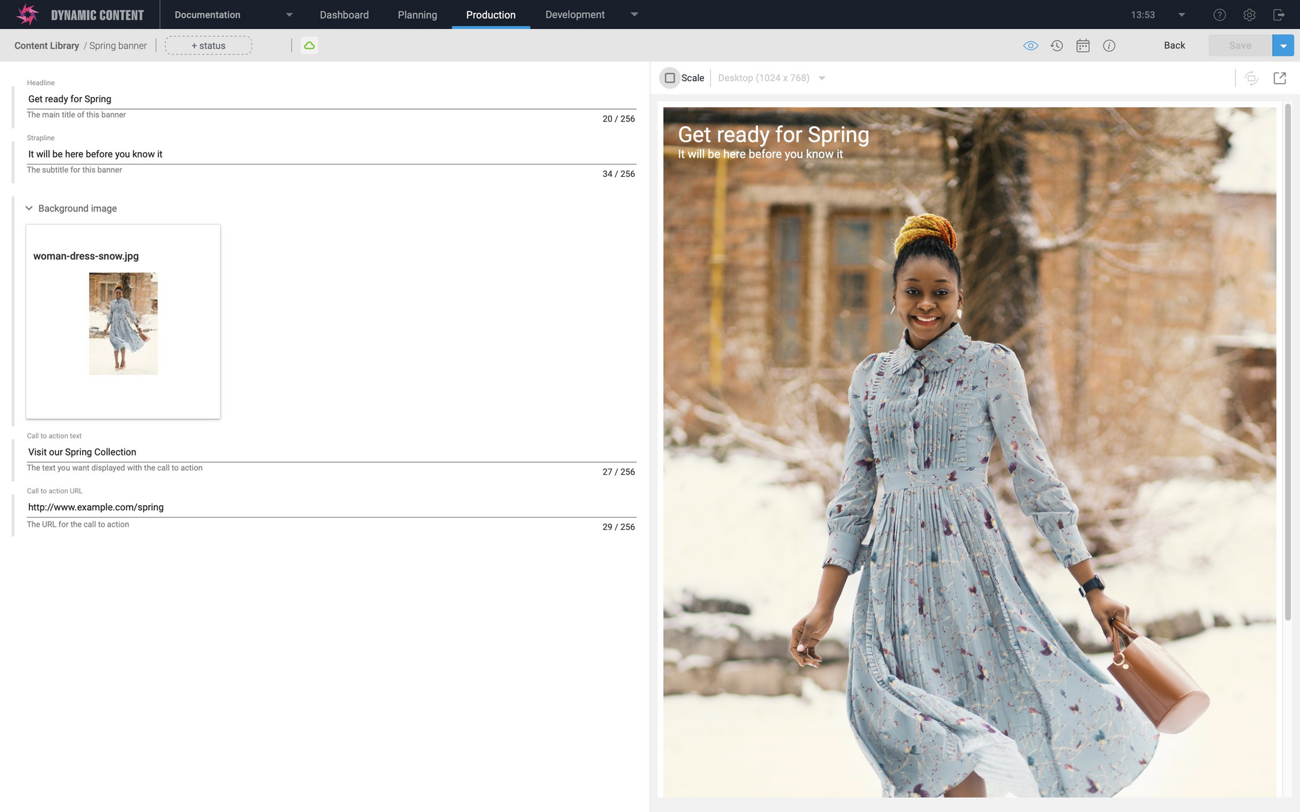
When the scale option is unchecked, the content can fill the entire visualization window and the device size menu and orientation icon will be grayed out.
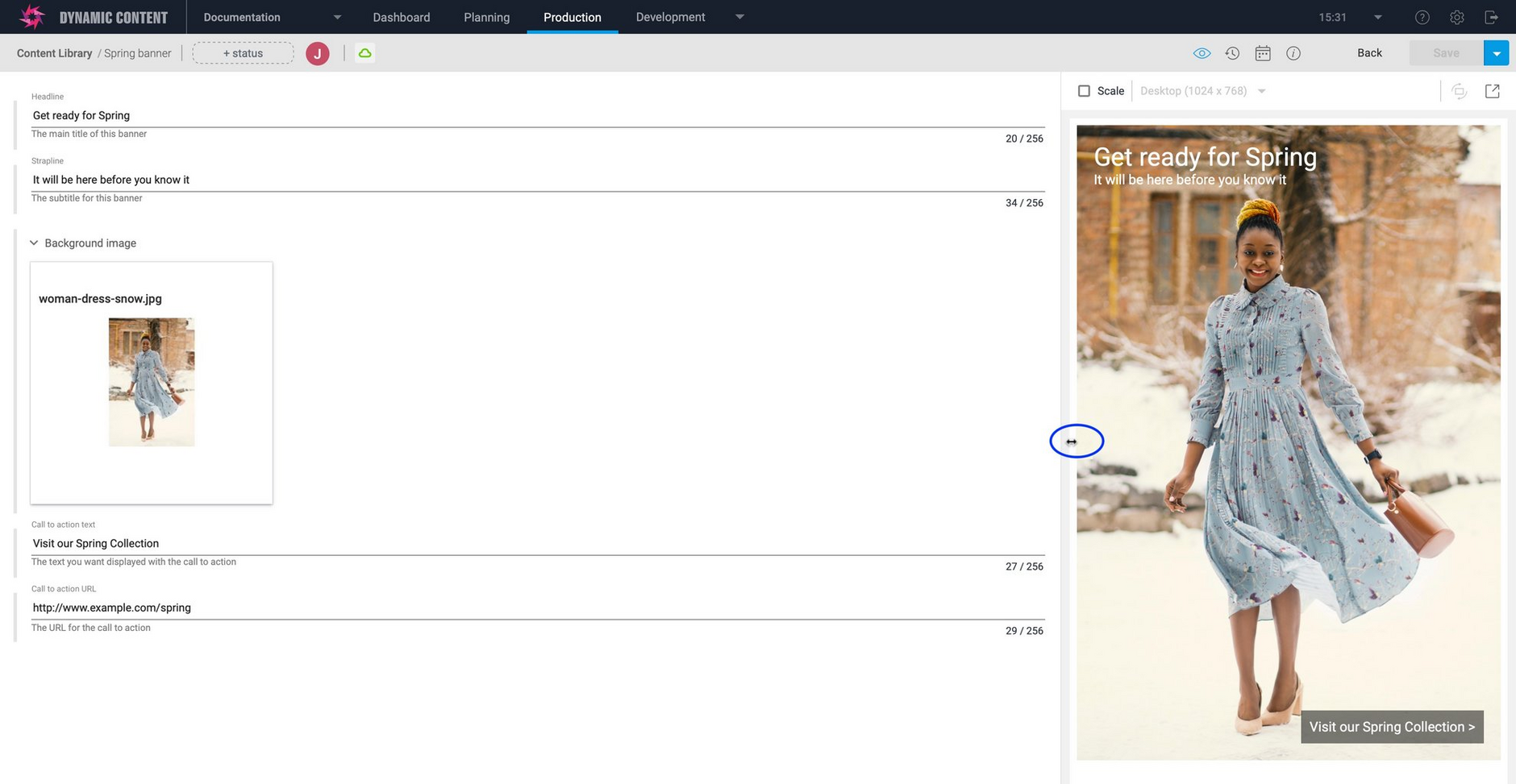
With scaling off, the visualization will redraw when you resize the visualization window by hovering over the left edge of the window until the resize icon appears and dragging the window to make it smaller or larger. This is a good way for developers to test out their visualization app to ensure that it's responsive. The site can’t be responsive in the scaled view because the width never changes.


