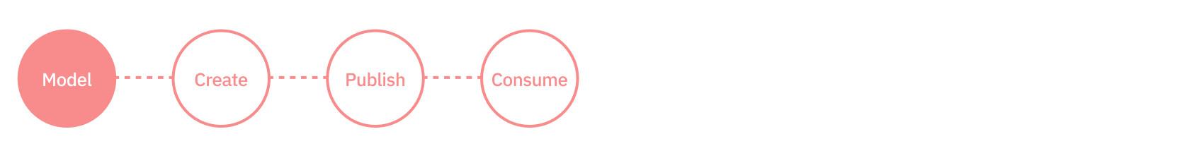
Step 1: Model

The first step when creating your website or app is content modeling- where the wireframes and requirements that make up your user experience are converted into a content model. This model is then used to create a content type. The content type is the blueprint for the banners, carousels, blog posts and other elements from which your users create the content that is published and then consumed from the CMS.
Info
If you're in a hurry and just want to see the code, or you don't have an Amplience account yet, you can go straight to Step 4: consuming the content. Or continue reading to learn about creating and registering a content type using the schema editor
What we're buildingLink copied!
In this tutorial we use the example of a simple banner shown in the wireframe below.


From the wireframe you can break down the banner into the elements from which the content type is created.
- The heading. This is a text item.
- The sub-heading. This is also a text item.
- The call to action text.
- The call to action URL that will be launched when the user clicks.
- The background. This is an image item.
In the rest of this step we'll take you step by step through creating the content type to represent the banner. Then you'll register the content type so you can use it to create some content.
Creating the content typeLink copied!
The data model for a content type is defined by its schema. With the schema editor, creating a schema is easy.
To create the banner schema, open the schema window by choosing "Content type schema" from the development menu and clicking the "Create schema" button.
You now have two choices: create your own schema or use one of the schema examples.

Tip
If you're short on time and don't want to build the schema from scratch, you can choose the banner from our schema examples.
-
Choose the "Tutorial banner" from the tutorials section on the left of the "Choose example schema" window and click "Use this schema".
-
From the "Name your schema" window, keep the default values and choose "Create schema".
The banner schema will be added to your hub and opened in the schema editor.
You can now skip to the register the schema as a content type section on this page.
Create a new schemaLink copied!
-
Click "Code from scratch" from the "Create content type schema" window.
-
Enter the schema ID. This should be URL that is unique within the hub. In this example we'll use
https://schema-examples.com/tutorial-bannerbut we don't enforce any standard for the schema ID, it just needs to be a URL so that the schema is a valid JSON Schema document. To create the banner schema on your own hub, you can use whatever URL you choose. -
From the validation type menu choose "Content Type" to ensure that the validation is applied for a content type schema and click the "Create schema" button to open the schema editor window.

Add the headline and subheadingLink copied!
In the schema editor choose each property to add from the "Add property" menu.
- Add
headlineandstraplineproperties as strings. To add these properties choose "Text" as the property type and add each one in turn.

When you add a property to the schema from the "Add property" menu, it will add the property with some default values. For the headline and strapline properties you'll need to change the property name, title, description and, if you choose, the minimum and maximum length.
The title is shown as the title for the property on the content form, while the description provides additional information to the user about what the property is used for.
When you've added the two properties, the properties section of your schema should look like:
Click the preview icon (immediately to the right of the "Add property" menu to see how these properties will look in the content form.

Add the imageLink copied!
In the banner, the background image consists of the image itself and some alt text. This is represented by a property of type object.
-
To add the background property, choose "Object" from the "Add property" menu. Edit the default values, changing the property name to
backgroundand the title to something like "Background image". -
To add the alt text, click to the right of
"properties": {and choose "Text" from the "Add property" menu. Change the property name toaltand the title to "Alternative text" or whatever you choose. You can removeminLengthandmaxLength. Set the description to something that explains what the alt text is. -
Finally you need to add the image itself. Click to the right of the closing "}" of the alt property and choose "Image" from the "Add property" menu. An image chooser property will be added to the schema window. When this is displayed in the content form the user will be able to choose an image from the media library.
-
Change the property name to
image.
With the background property added, the properties section of your schema should now look like:
When you preview the content form now, the background image property is shown. This is only a preview, so you can't choose an image from the media library.

Add the call to actionLink copied!
As with the background property that you just added, the call to action is represented as a property of type object. Within the object will be the call to action URL and title.
-
Choose "Object" from the "Add property" menu and add a property called
link. -
Add two string properties within
link:urlandtitle. You don't needminLengthormaxLength. -
When all the properties have been added and the schema is valid, click "Save".
With the link added, your full schema should now look like:
Here's how the completed banner schema looks in the form preview.

Congratulations. The banner schema is now complete. Now you're ready to register the content type so that you can use it to create content.
Register the content typeLink copied!
Before you can create banner content, you first need to register the content type. When you register a content type you can also enrich it with an icon, a card and one or more visualizations. These features make it easier for users to work with content created from this content type.
- Choose "Register as content type" from the schema editor's save menu.

The content type registration window opens.
-
Give the content type a label. This will help identify the content type when you are creating content.
-
You also need to choose the repositories on which the content type is enabled. Once a content type is enabled on a repository it can be used to created content in that repository.

- Click "Save" to register the content type.
Info
The following steps are optional. You can move on to the next step: creating the content.
Optional stepsLink copied!
Add an iconLink copied!
The content type icon helps to identify a content type when you're choosing what content to create. Typically you'll have many different types of content: pages, blogs, sliders, for example and using an icon makes it faster to find what you need. You can choose not to add an icon, but it makes it easier for your users.
-
In the box labelled "Content type icon" click the "+" button. Choose an icon from one of our collections. The banner icon from the "Potter" collection is a good choice. You can also add your own icon by specifying an image URL.
-
Click "Save" when you've chosen an icon.
Choose a content cardLink copied!
A content card is a visual representation of a piece of content and makes it easy to identify in the content library. For the banner you don't need to include the headline, subheading and call to action on the card, the best way to identify a piece of content is using the background image.
-
In the box labelled "content type card" click the "+" icon.
-
The "Choose content type card" window is displayed. From here you can choose from our built in cards. Choose the "Photo" card.

-
In the "card parameters" section you need to enter the properties that will provide the data to be displayed on the card.
-
For the image enter
/background/image. This property will be used to display the image on the card. -
For the alt text enter
/background/alt. If the image cannot be displayed, the alt text will be shown on the card instead.
When you've configured the card click "Save".
The icon and card are now configured.

Configure a visualizationLink copied!
The final thing you need to configure is a visualization. This allows users to preview content while they work on it and before it's live on a website or app. For the banner content type we've created a realtime visualization that will reflect changes as the user makes them, without the content having to be saved each time.
- Click the "Visualizations" tab at the top of the content type registration window. Choose the "Add new" button.

-
Give the visualization a name. The example below uses "Realtime viz" but you can call it anything you want. You can have multiple visualizations, so the label helps identify each one.
-
For the visualization URL enter the URL of the visualization we've created for the banner content type.
A visualization is a web app which renders a single piece of content within the content editing interface. The parameters at the end of the URL provide additional information used to preview the content. You can find out much more in our visualization guide.
Once the visualization is configured, click "Save". The content type is now assigned an icon, card and visualization.
Now that the banner content type is registered, you're ready to use it to move to the next step and create some content.