Dynamic Content- Content Library enhancements
Release date: 28th September 2021
In this release we've made some changes to the Content Library to make it easier for you to find and organize your content. You can now collapse and expand the side panel to give you more space to work with, navigate and manage your folders more easily, and access filters with one click.
On this page we'll provide you with an overview of what's changed.
Video: introducing the updated Content LibraryLink copied!
This video gives you a quick tour of the new features and shows you what you can do with the updated Content Library.
Updated navigationLink copied!
We've changed the names of the items in the masthead to better reflect the content production workflow. "Production" is now known as "Content", while "Planning" has been renamed to "Scheduling", and the order has been swapped so "Content" appears first. The features found in the "Content" and "Scheduling" sections haven't changed.
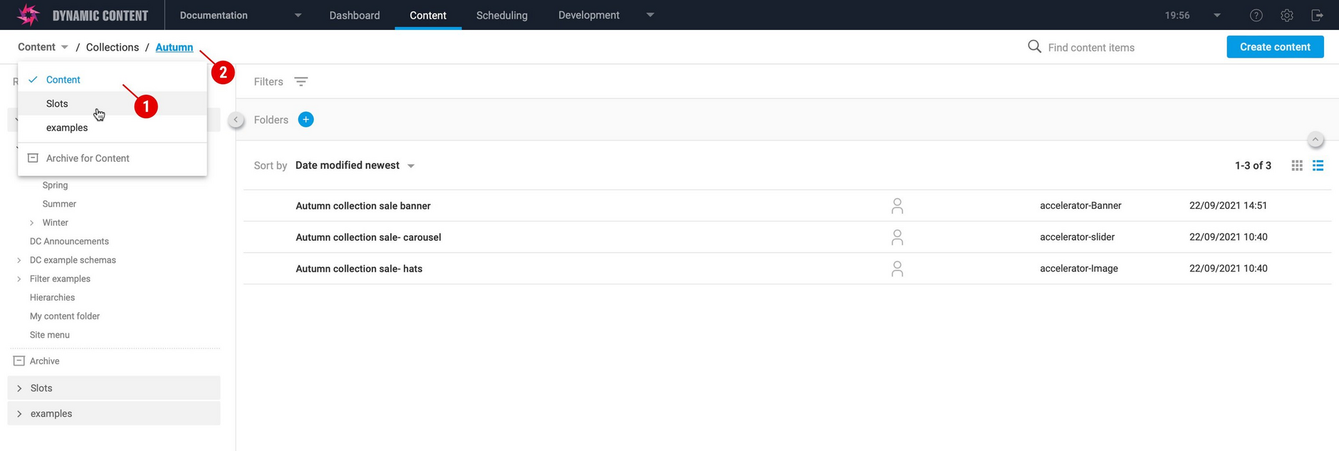
A new breadcrumb menu makes it easy to switch between repositories (1 in the image below). This is especially useful if you have lots of repositories on a hub.
The breadcrumb also shows the folder structure, so you can see exactly which folder you're in and easily switch between them. In the image below the folder called "Autumn" is selected and you can see that it's within a folder called "Collections" in the repository named "Content".
More space to focus on your contentLink copied!
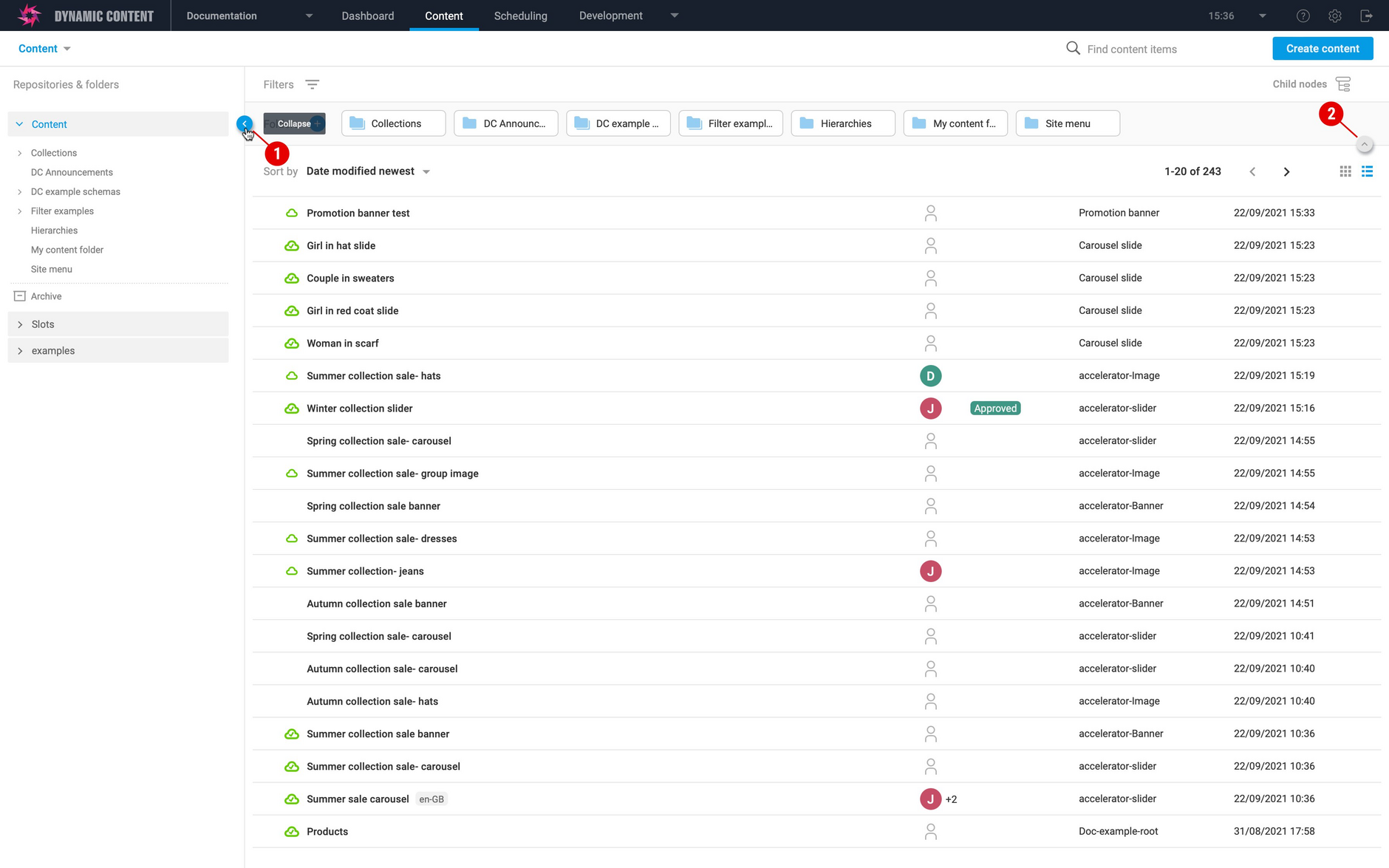
You can now collapse the left hand panel by clicking the collapse icon (1 in the image below) to give you more space and allow you to focus on your content.
If you want to collapse the folder navigation click the folder view icon (2). You can toggle this on and off at any time to show your folders again.
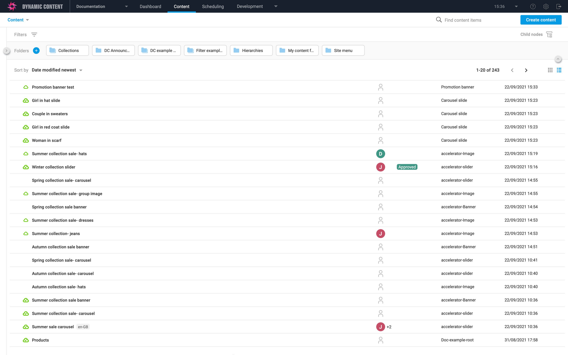
The view of your content expands to fill the space available, with more space for content item names and your folder structure.
All of the new features work with both list view and grid view. So if you prefer a graphical view of your content, then you can also take advantage of increased workspace.
Managing foldersLink copied!
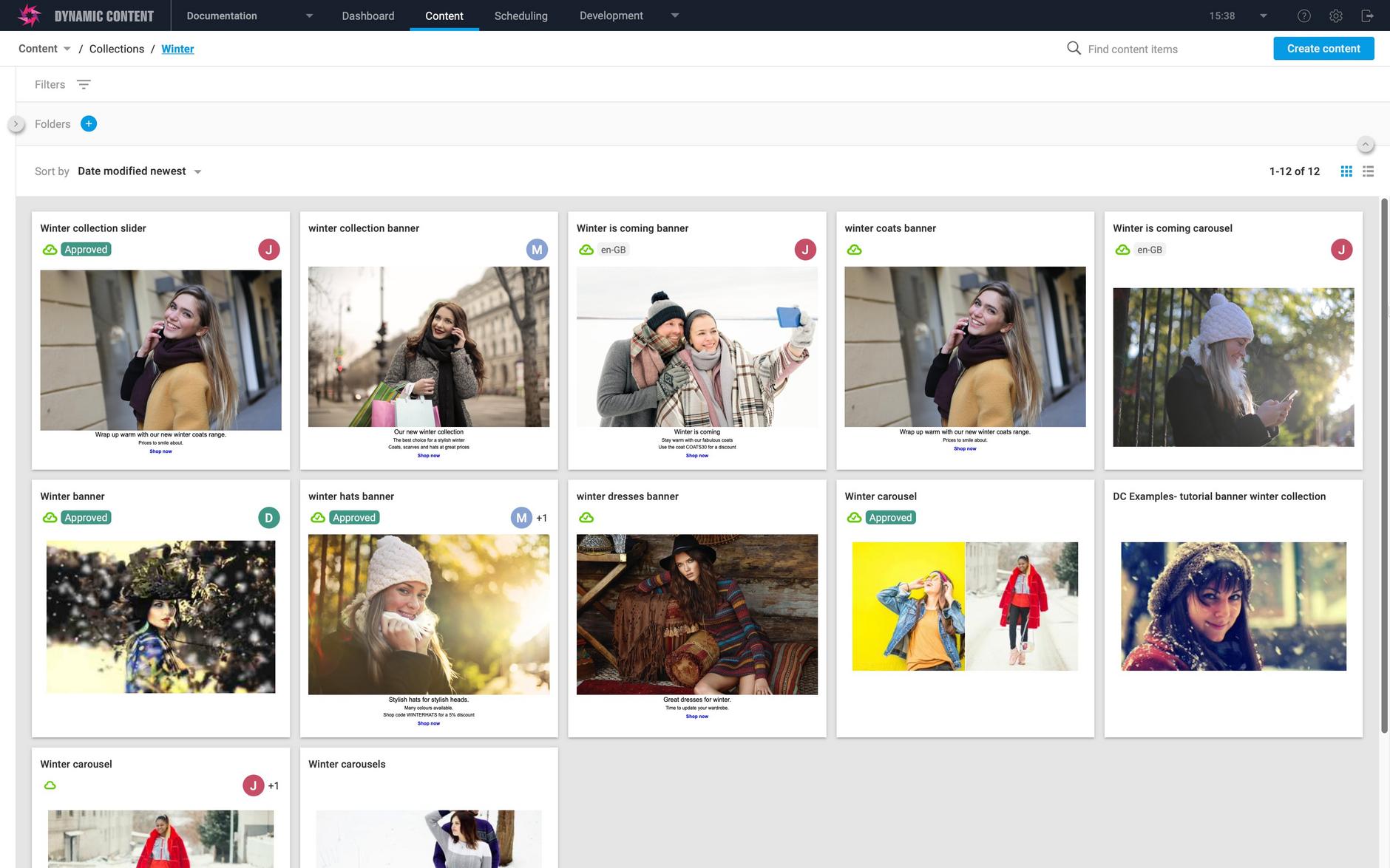
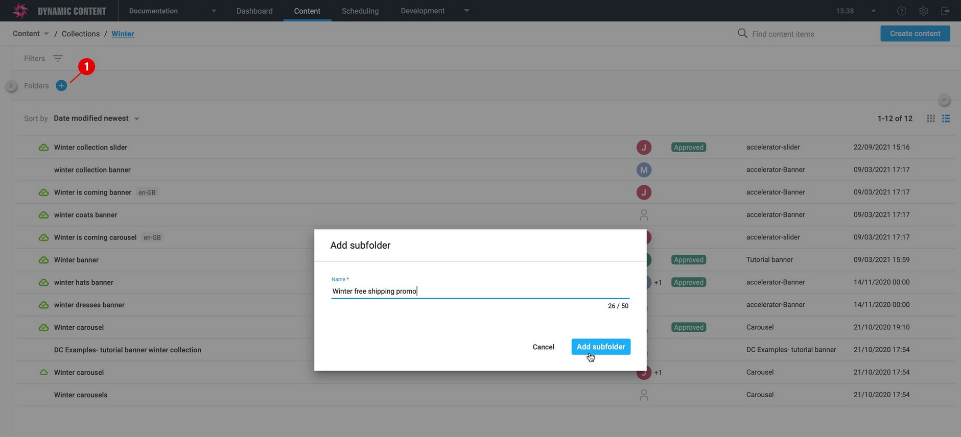
It's not just easy to navigate your folder structure, we've also added a shortcut to create new folders. Just click the "+" icon (1 in the image below) to bring up a dialog allowing you to create a new folder at the current place in your folder structure. In the example below, a folder is created within the "Winter" folder.
Moving content items between folders is also a lot easier. Just select the content you want to move and drag it to destination folder. In the example below we're moving the "Winter collection slider" item to the "Winter" folder. You've always been able to move content between folders, but now it's a lot more convenient.
FiltersLink copied!
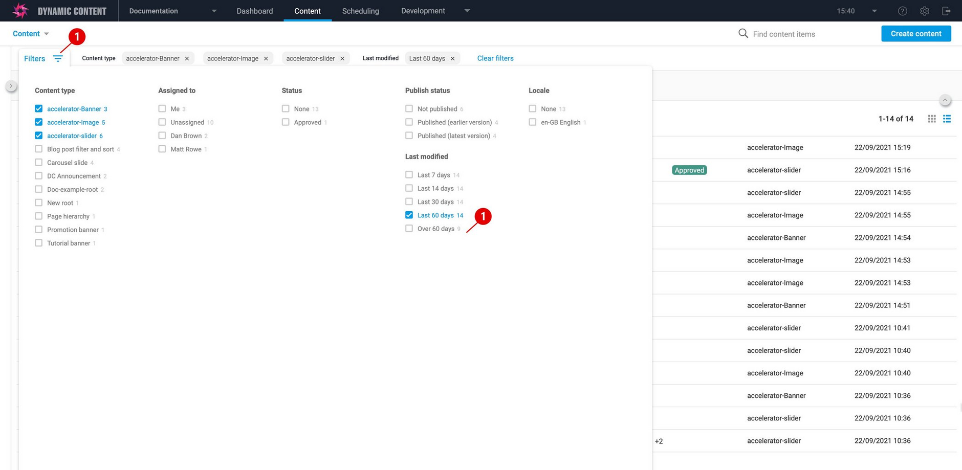
You can now access filters by clicking the filter icon at the top of the window. It's easier to see what filters are being used and you can clear the ones you don't need.
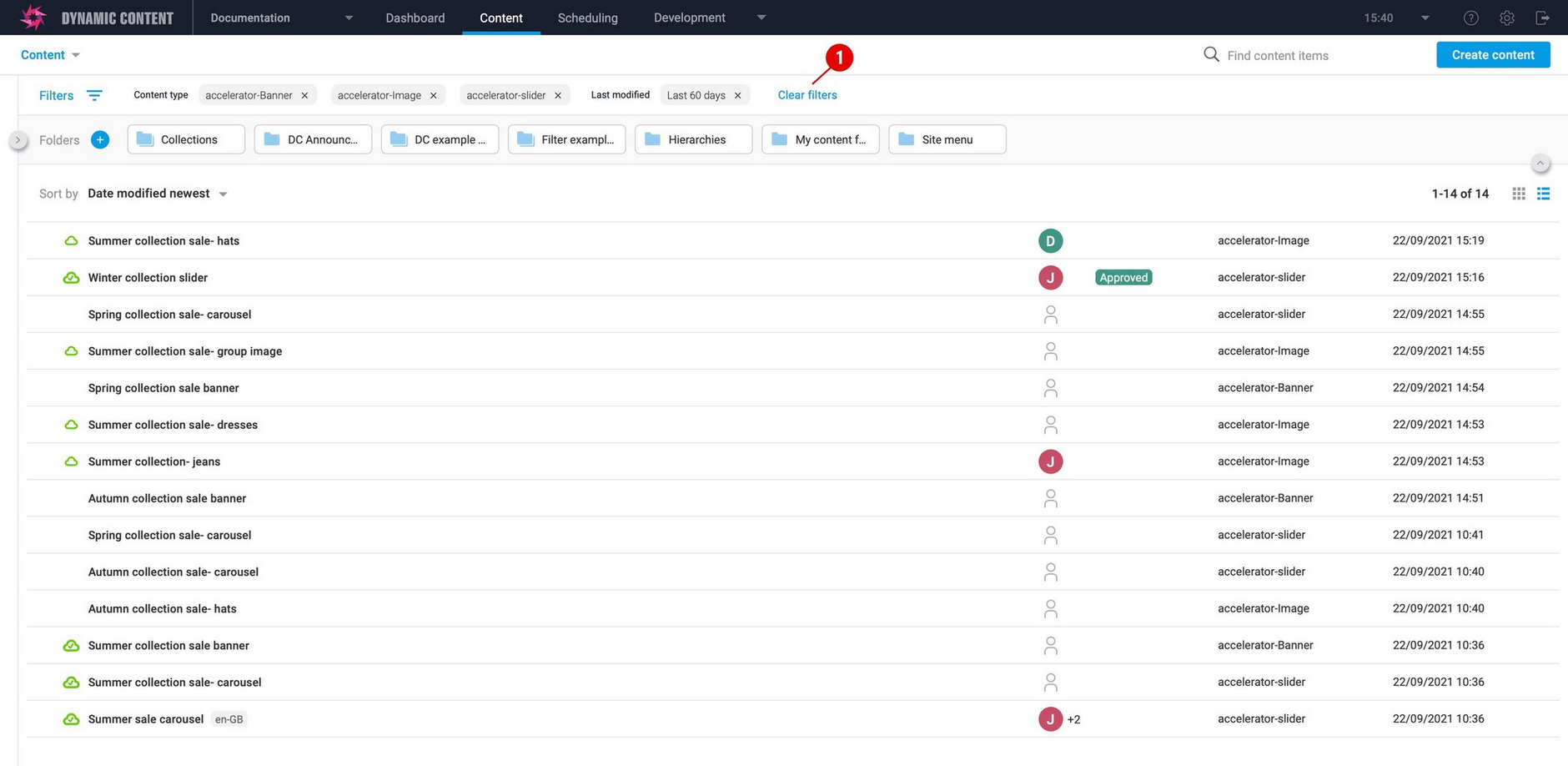
In the image below we've set up a filter for images, banners and sliders modified in the last 60 days and the active filters are shown at the top of the window. Click "Clear filters" to show an unfiltered view of your content.
SearchLink copied!
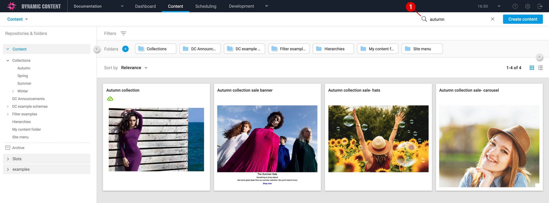
We've moved the location of the search button so that it's in a more convenient place- closer to you content. In the example below we're searching for content items containing "autumn".
New features in the scheduling viewLink copied!
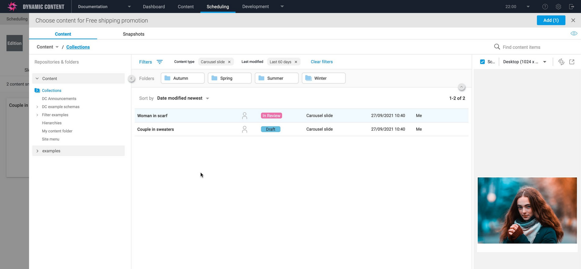
The new Content Library features are also available in the scheduling view. When you add content to a slot or directly to an edition, you can make use of filters and the improved folder navigation. In the example below we're browsing content in the "Collections" folder with a filter of carousel slides modified in the last 60 days.

