Working with content types
In order to create content of a particular content type, you first need to register the content type on a hub and associate it with one or more repositories. A content type consists of the content type schema URL, together with a label and optionally an icon, card and one or more visualizations. Content types are what business users will use to create content in the Dynamic Content app.
Managing content typesLink copied!
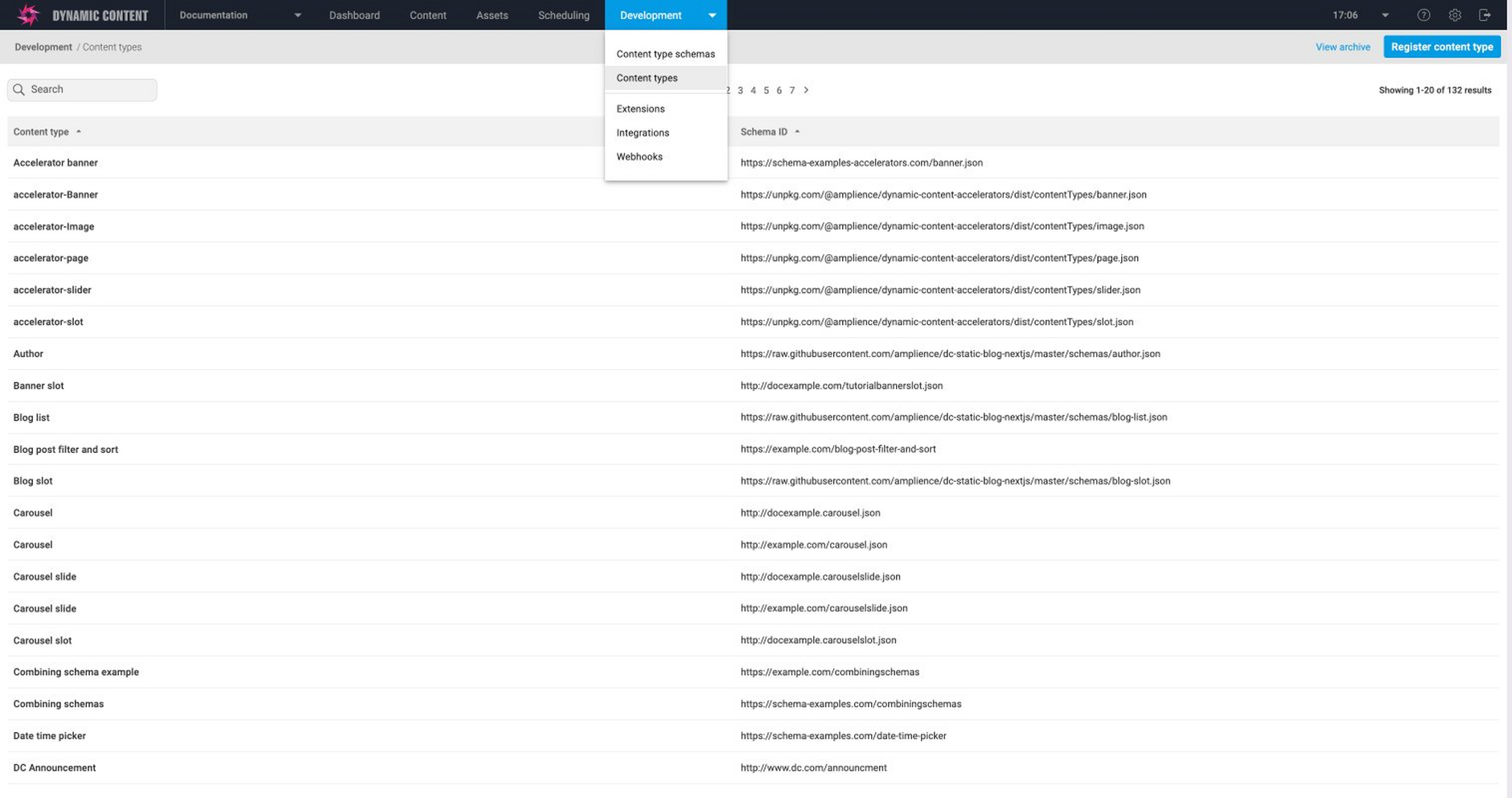
You manage content types from the content types window. To open this window choose "Content types" from the Development tab in the Dynamic Content app. A list of the content types already registered on this hub is shown.
To register a content type click the "Register content type" button.
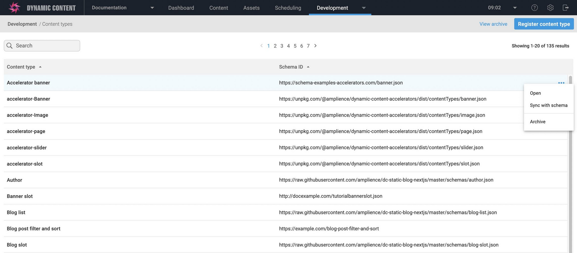
The content type contextual menu contains two items: Open and Sync with schema
-
Open opens up the Register Content Types window for this type, allowing you to add or modify icons, cards and visualizations, together with the repositories on which this content type is enabled.
-
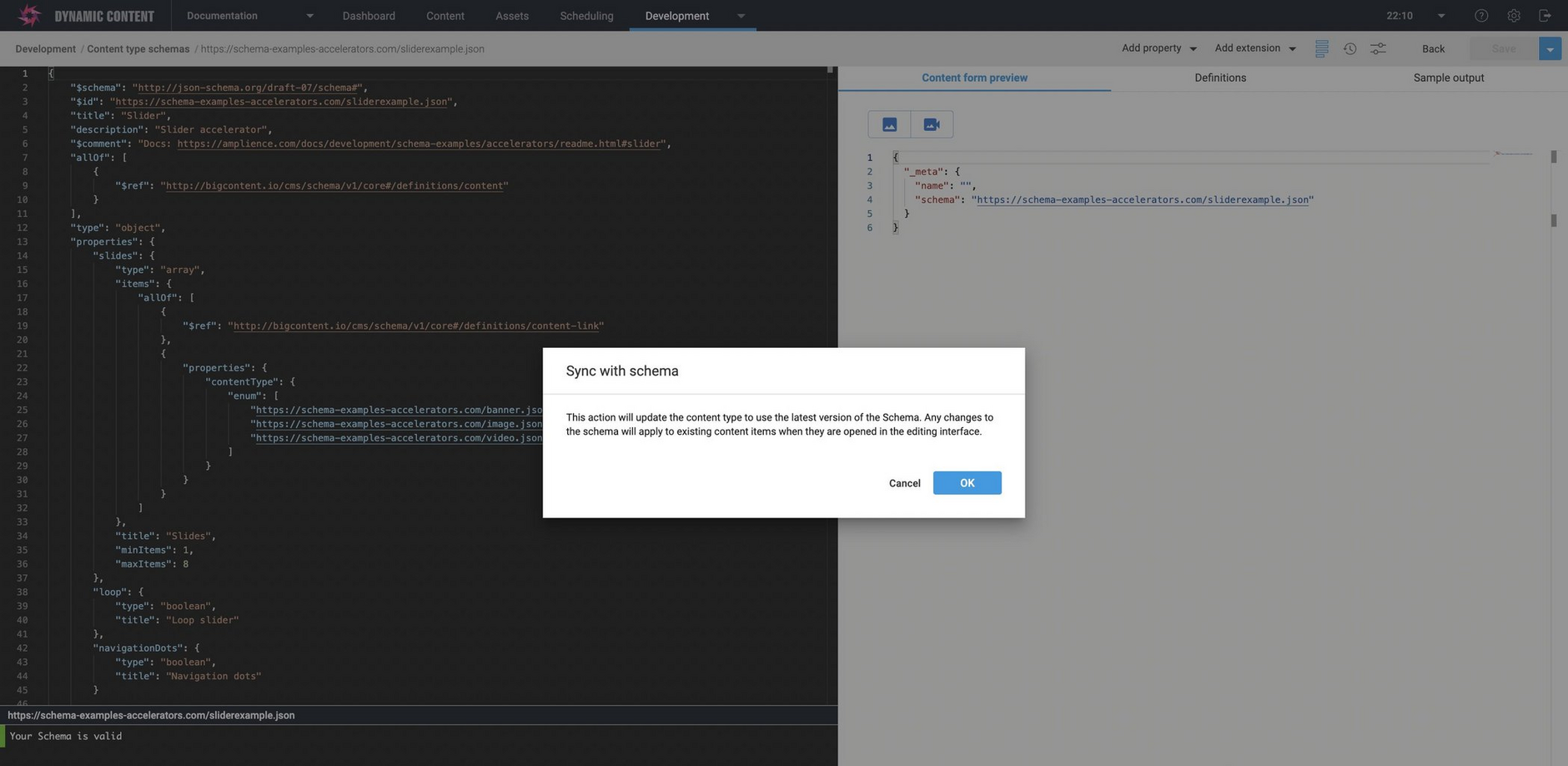
Sync with schema ensures that the content type is using the latest version of the content type schema it was registered with.
Registering content typesLink copied!
Content types are registered from content type schemas that are either created using the schema editor and stored internally, or externally on a web based services such as AWS. Registering a content type and associating it with one or more content repositories makes it available for a user to use to create content.
In this section we'll walk through the process of registering a content type, add an icon to help identify it in the content types window, configure a card to provide a representation of a content item in the Content Library, and set up a visualization to allow the user to preview a content item in the content form.
Slot types are registered in the same way as content types and associated with one or more slot repositories.
Registering from the content types windowLink copied!
To register a content type, select "content types" from the Development tab at the top of the Dynamic Content window. A list of content types registered to this hub will be displayed, with their label and their URL. To register a new content type click the "Register content type button".
Note that you can also register a content type directly from the schema editor window.
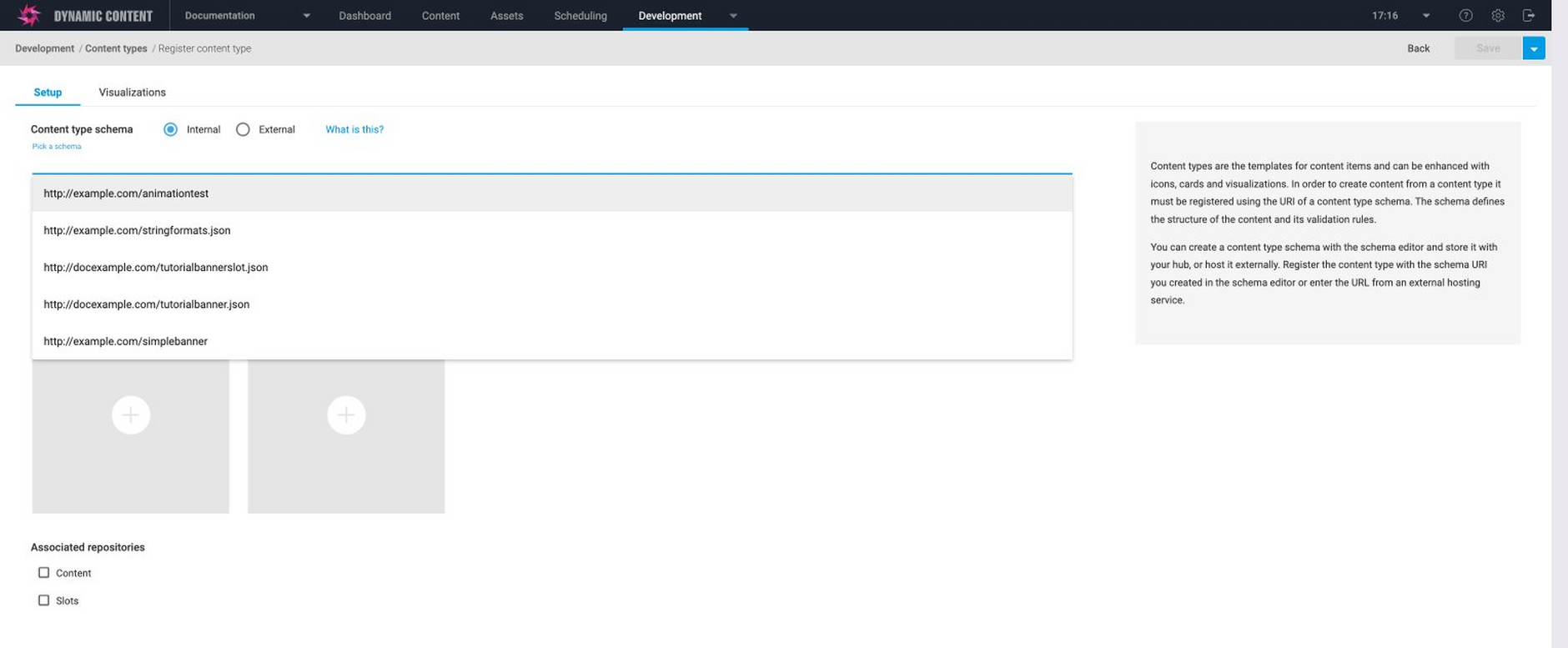
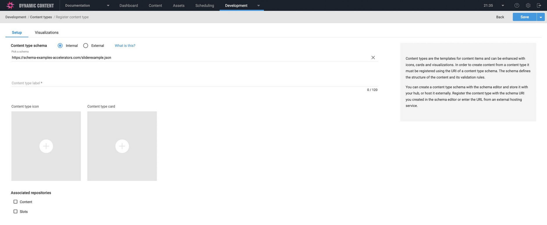
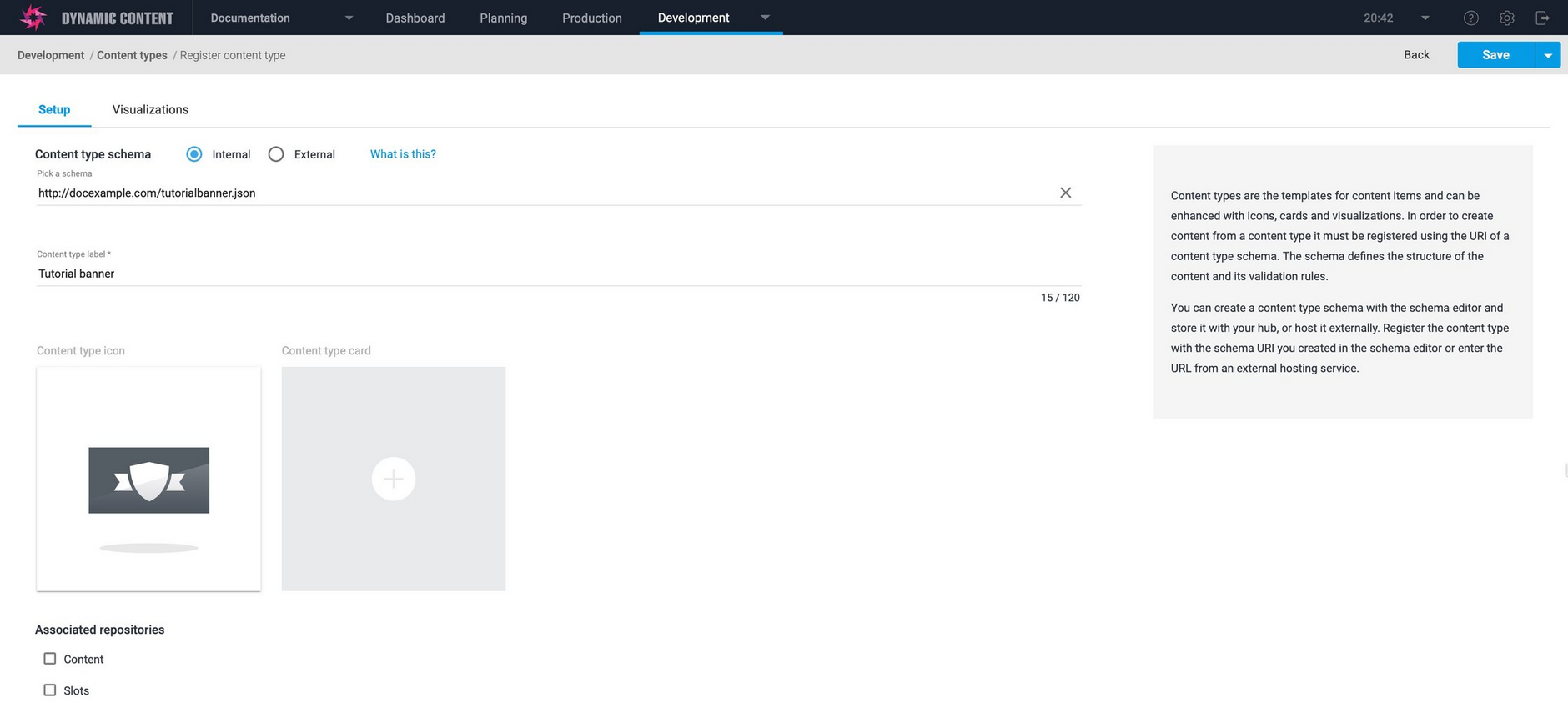
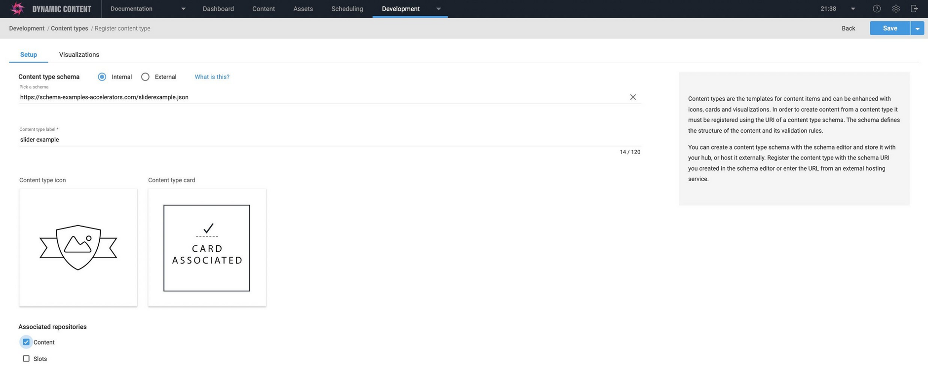
The register content type window is displayed. In this example we're adding the tutorial banner content type.
To register a content type you need to provide the URL of a content type schema. Schemas can be created with the schema editor and stored with your Dynamic Content hub, or hosted externally on a service such as AWS or GitHub.
In this example the content type schema was created with the schema editor so we will select "internal" and choose the tutorial banner schema from the list. If the schema is stored externally, choose "external" and enter the URL.
The maximum length of the content type URI is 950 characters.
See the schema editor for more examples of creating and registering schemas.
You will also need to provide a label- this is used in the content type window in the production view to help identify the type of content to be created. We will give it the label "Tutorial banner".
Registering content types from the schema editorLink copied!
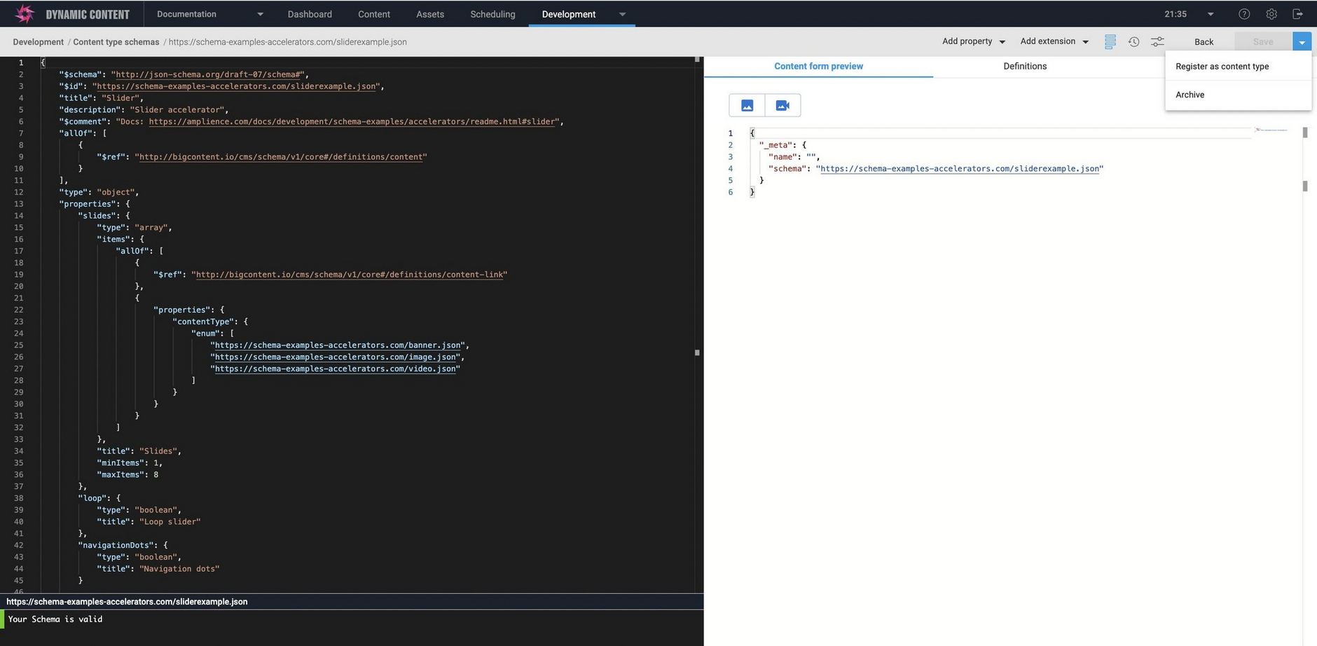
You can also register a content type directly from the schema editor.
With your schema open in the schema editor, choose "Save and register as content type" from the schema editor Save menu. If you've already saved your schema, then the menu item will be "Register as a content type".
The content type registration window will then open, with your schema already selected.
Enter the content type label and then configure the rest of the fields as explained below.
Choosing an iconLink copied!
The content type icon is used to help to visually identify a content type in the create new content window in the production view.
You can add an icon to a content type by providing the URL to a 256x256 pixel image or choosing one of the standard icons. In this case we'll choose the hero banner icon.
Once you choose an icon, click "Save" to return to the register content type window. For more information see updating content type icons and using your own custom icons.
Configuring a cardLink copied!
A card provides a graphical representation of a piece of content in the Content Library. This enables users to quickly identify a piece of content when viewing items of this content type in the Content Library. Cards are web apps that are associated with a content type, and depending on your requirements you can either use one of the built-in cards or develop your own.
Choosing a card for a content typeLink copied!
To configure a card to use with this content type, click the "+" icon in the content type card section.
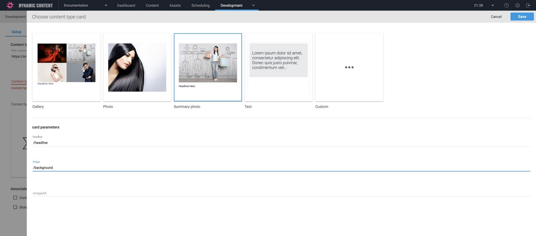
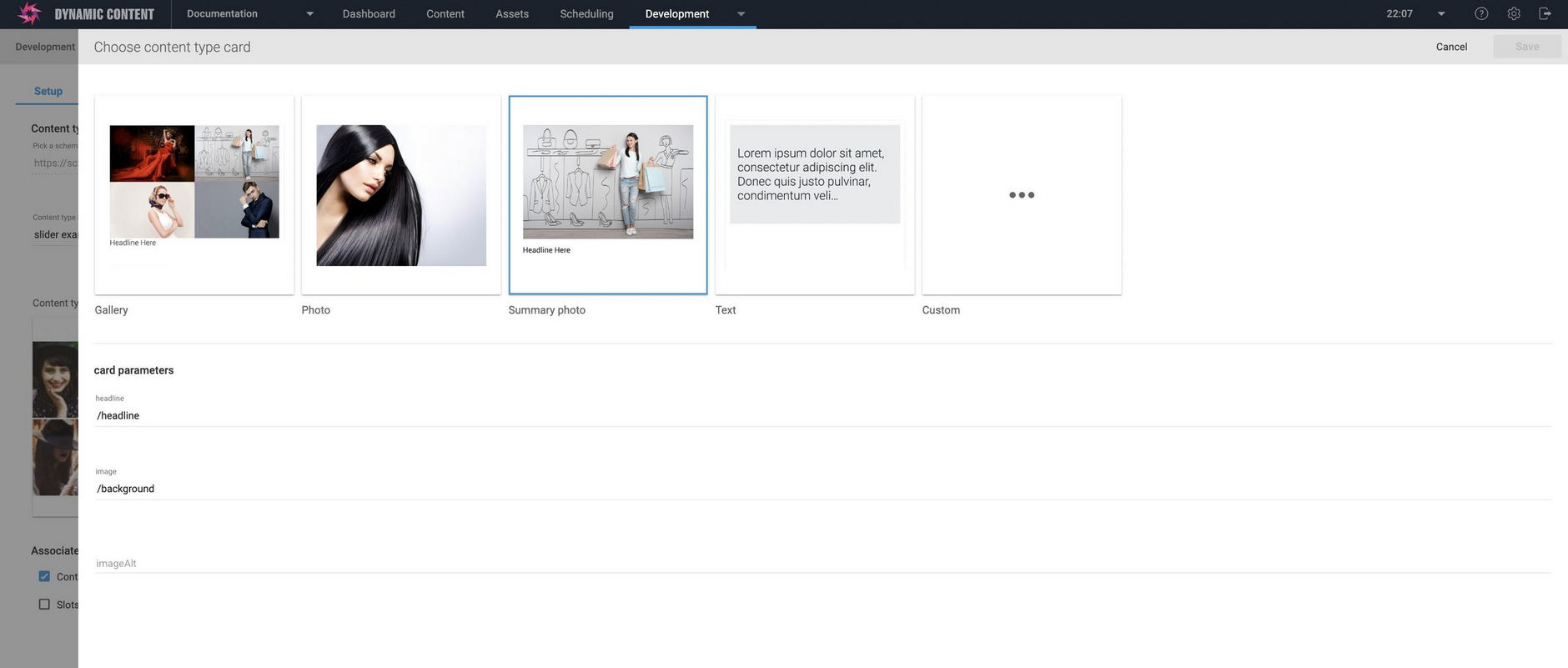
You can provide the URL to your own custom card or choose from one of our out of the box cards, each providing a different way of representing your content. For this example we'll use the summary photo card. This will display an image with some text underneath.
Mapping content type properties to a cardLink copied!
Each card includes a number of configurable fields that determine how the card content should be displayed. You will map the chosen properties in your content type to the fields displayed on the content card.
When you select one of the built-in cards, the fields that are available to be mapped from the content type are displayed. In the example shown below, the Summary-photo card is selected and this supports headline, image and image-alt text.
For example, the banner type includes properties named "headline" and "background". We want the value of the headline property to be displayed on the card, so we enter "/headline" in the headline field and "/background" for the image.
When content of this type is shown in the content library, the background image will be displayed with the headline text underneath.
When your chosen card is configured, click the "Save" button to return to the main screen.
For more information about content cards, creating your own cards and mapping fields from linked content see the Cards.
Enabling the content type on a repositoryLink copied!
Before a content type can be used to create content, it must be enabled on at least one content repository. Choose the repositories on which you want to enable the content type from the list of available repositories in the "Associated repositories" section.
In this example there are just two repositories, one for content and one for slots, but each repository within the hub will be displayed. Once a content type has been enabled for a repository, it will be available to use to create content.
If you are registering a slot type, then choose one or more slot repositories on which to register it. See the slots for more details of creating and working with slot types.
Setting up visualizationsLink copied!
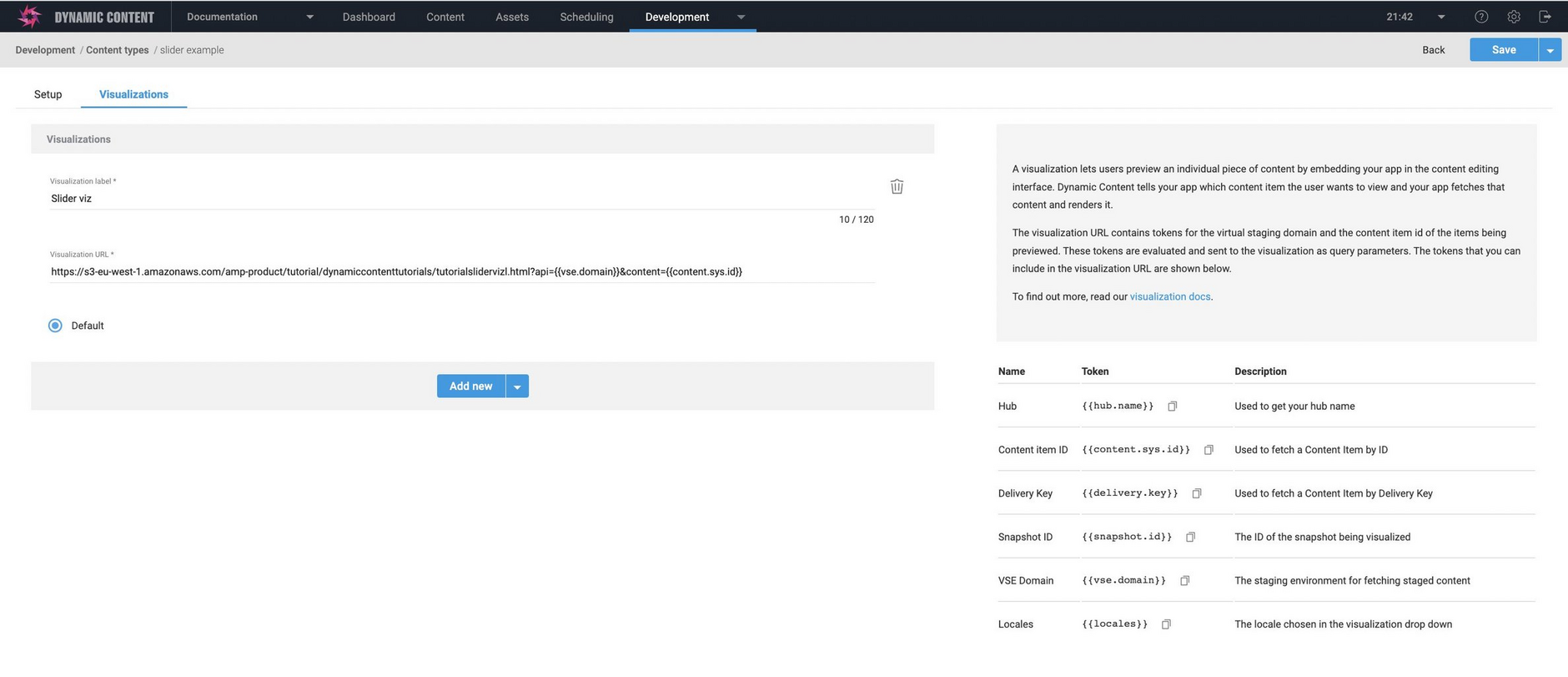
If you want to provide a visualization for the content type, choose the "Visualizations" tab and click the "+" icon.
Give the visualization a label and enter the templated visualization URL in the field provided. Note that you must provide the complete URL, including all the templated variables.
If you want to add an additional visualization, click the "+" icon again.
For more information about developing visualizations see the developing a visualization page.
Completing the content type registrationLink copied!
Click Save to register the content type with the hub. If the content type is valid, then a message appears indicating that the content type has been registered. Note that an error message will also be displayed if the content type URL is the same as another content type already registered on this hub.
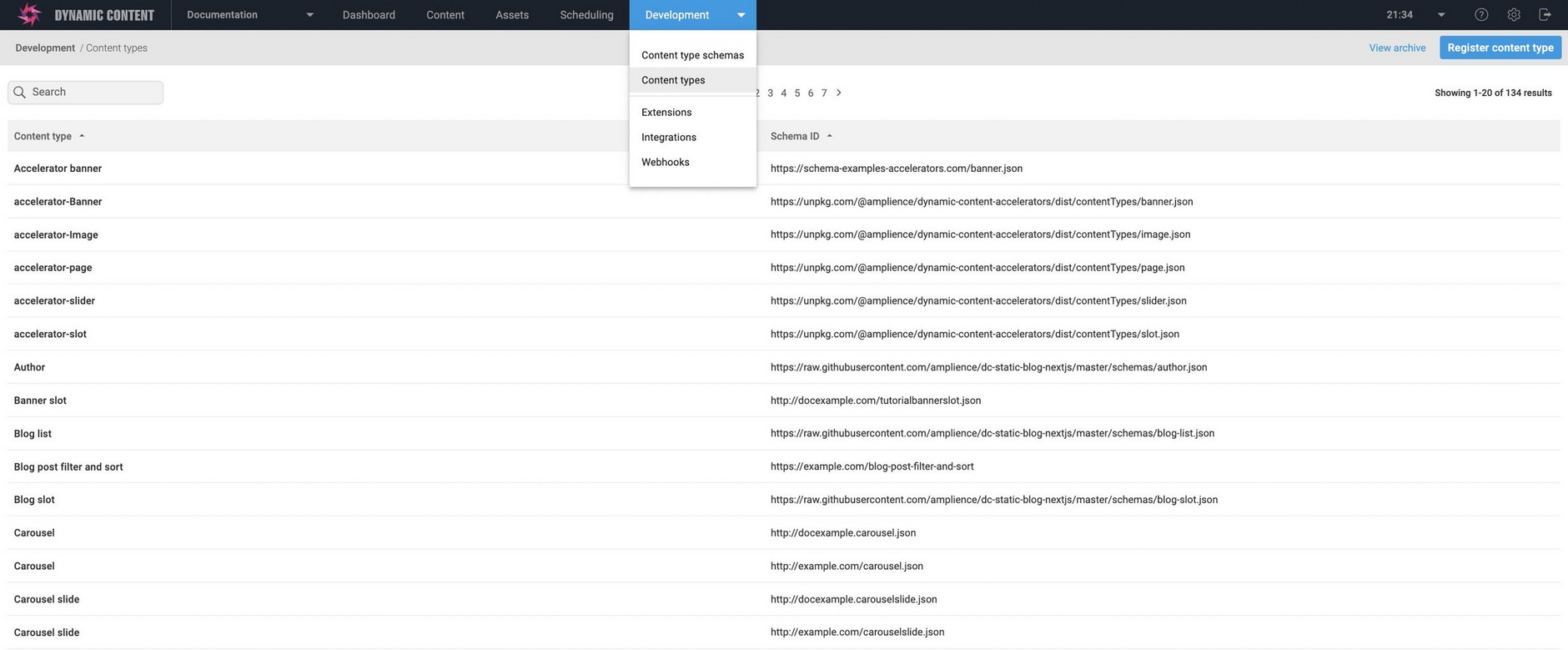
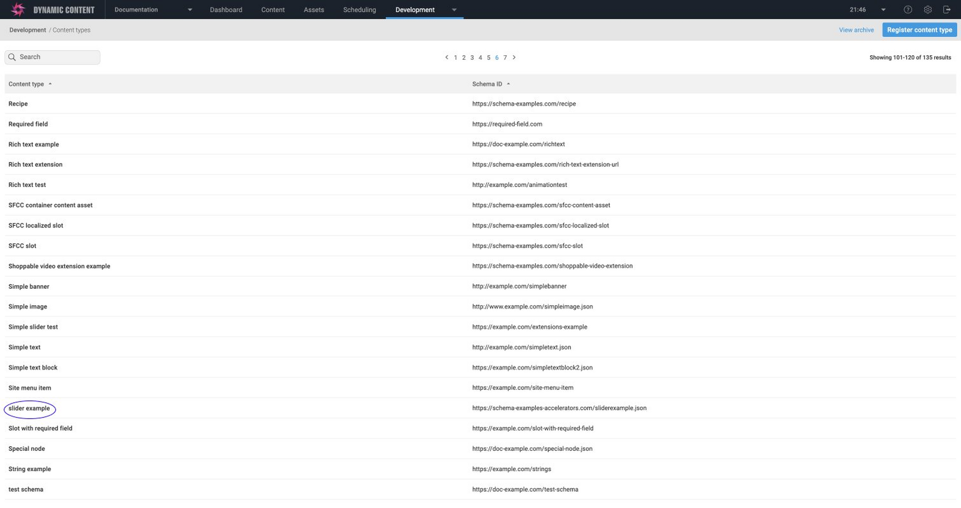
Once registered with the hub, the content type appears in the list. In the image below, the newly added slider example is highlighted.
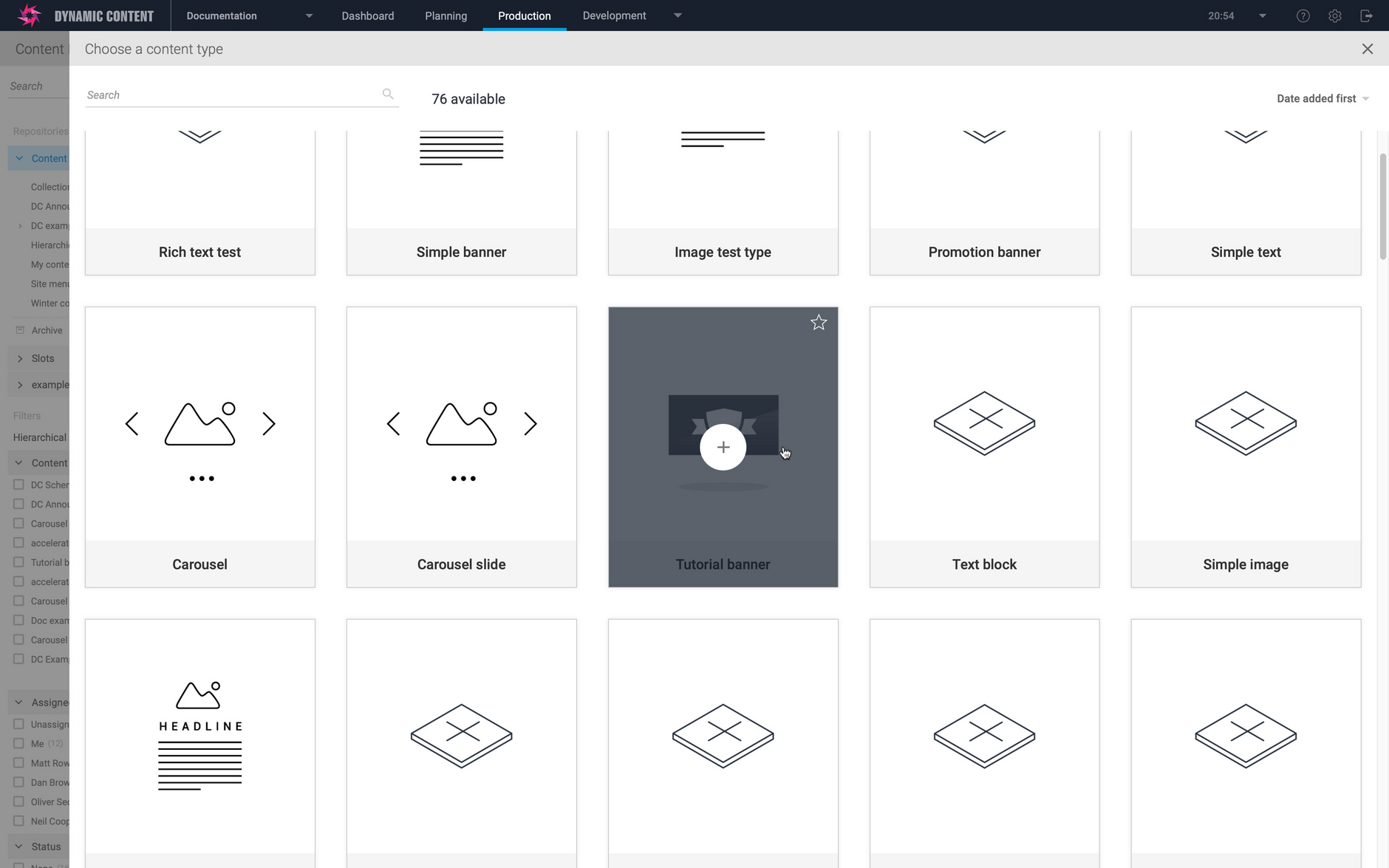
In the production view, the tutorial banner is now available from the content types window and can be used to create content.
IconsLink copied!
The content type icon is used to help business users to visually identify a content type in the "create new content" window. You can change the icon that has been set for a content type to a different built-in icon or your own custom icon.
Changing a content type iconLink copied!
Icons are specified in the "register content type" window and you can choose one of our built-in icons or provide the URL to your own.
If you're updating a content type and that type already has an icon associated with it, click the pencil icon to edit the icon setting and then choose a new one.
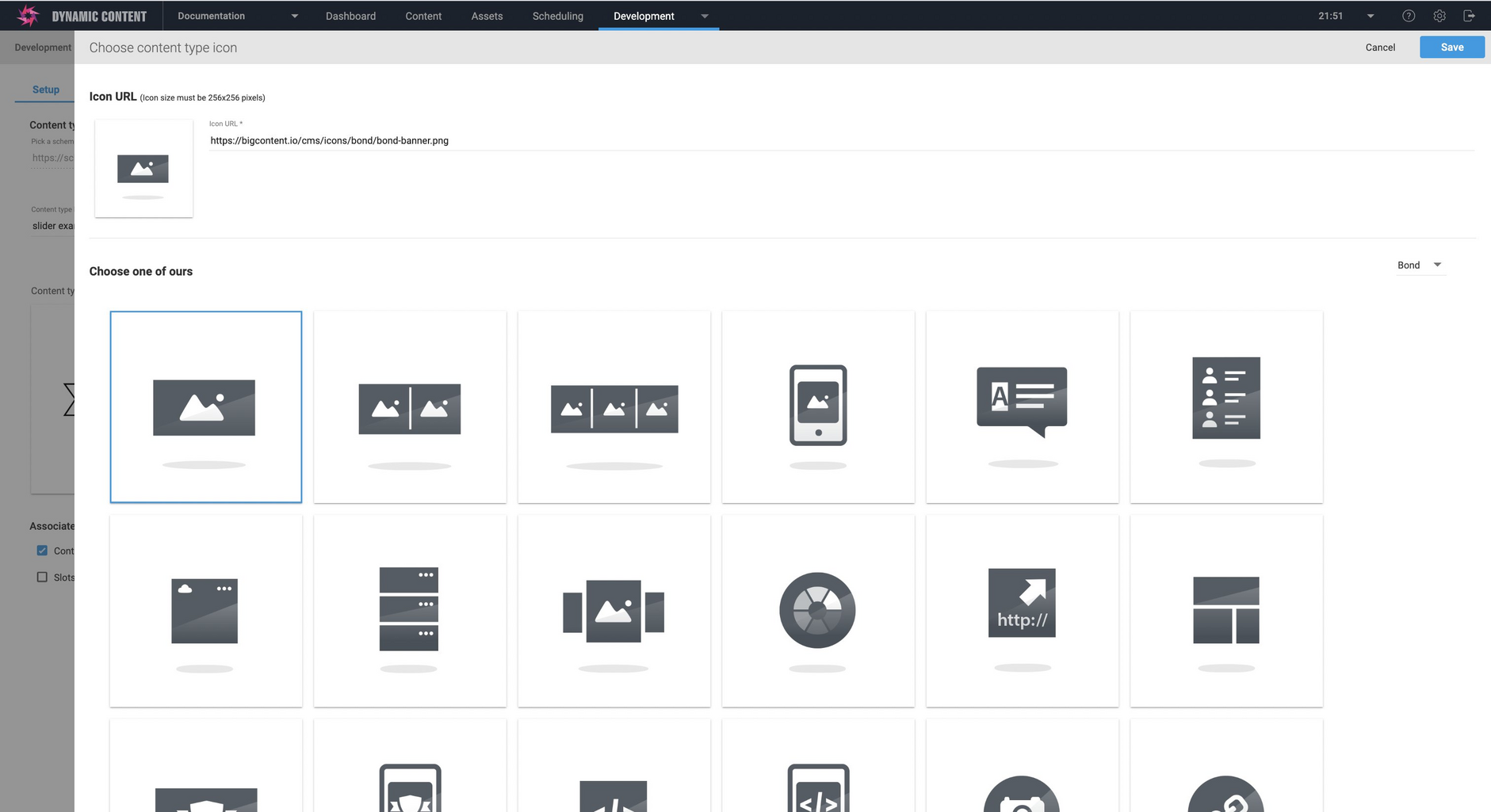
The "Choose content type icon" window is displayed. From here you can choose from one of our built-in icons or specify the URL of your own. Several libraries of icons are available, each with different styles. In the example shown below the banner icon is chosen from the icon library called "Bond".
Choose an icon and click "Save".
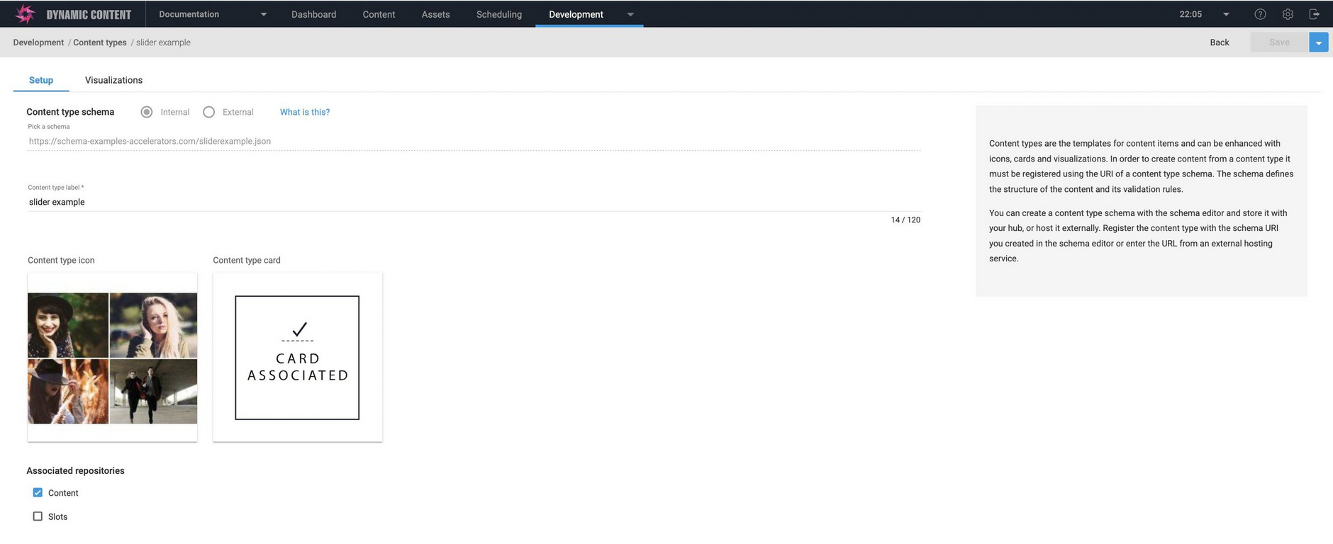
The icon you chose is now shown. Click the "Save" button to apply your changes to the content type.
Using a custom icon for a content typeLink copied!
For the carousel content type we want to use a custom icon- a grid of images. This will make the carousel content type easier to identify when we create new content.
To use a custom icon you need to specify the URL of a 256x256 pixel image in the "Add your own section". In this example the custom icon image has been uploaded to Content Hub.
When you've entered a custom URL or chosen a built-in icon, click the "Save" button.
The custom icon is now associated with the carousel content type.
The custom icon is also shown in the Content Types window when creating a new content item.
CardsLink copied!
Parameters of the built in cardsLink copied!
The built in cards each have their own specific parameters, listed below.
GalleryLink copied!
The gallery card displays a piece of headline text, together with between 1 and 4 images. The images are arranged in a grid layout.
Mapped fields: headline, image0. Optionally image1, image2, image3 and imageAlt text for each image.
The example below shows an item created using the tutorial banner content type. We just have a single image and some headline text, so will enter /headline in the headline field of the card and /background for the image0 field. When tutorial banner content is displayed in the Content Library, its card will be shown with the background image and headline text underneath.
If you have linked content such as a carousel containing multiple carousel slides, you can map up to 4 carousel images to the gallery card. See the nested content for more information about how you map card fields to properties within nested content.
PhotoLink copied!
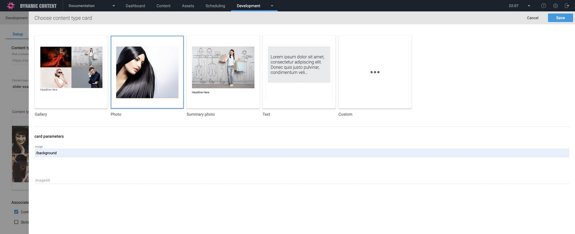
The Photo library card just shows a single image, centred on and filling the card.
Mapped fields: image
Summary-photoLink copied!
The summary-photo card shows a single image and some text underneath it.
Mapped fields: image, headline
TextLink copied!
The Text library card displays the headline text centred on the card rendered at 24 point. This card is useful in the cases where you want to identify a piece of content based on its text rather than images.
Mapped fields: headline
Using cards with nested contentLink copied!
You can configure the built-in cards to work with nested content, such as a carousel that contains one or more carousel slides.
You'll need to specify the mapping for each field using the JSON Pointer standard. This allows you to identify a specific value within JSON content, such as an image within an array.
In this example we're registering the carousel content type. In the carousel the "slides" property contains an array of carousel slides and each slide contains an "image" property. The gallery card can display up to 4 images in a grid, so we want to use the it to display the image of each of the slides. We specify "/slides/0/image" for image0 and so on up to image3.
Developing custom cardsLink copied!
The custom card web app is specified as a templated URL, including parameters such as the VSE domain and content ID, that are filled in by the platform at runtime and sent to the card as query parameters.
The way a card app is organised is very similar to a visualization and for more details about retrieving and rendering content see the visualizations page.
PrerequisitesLink copied!
- You must have a virtual staging environment specified in your settings in order to show visualizations for any content.
- The current user's IP address must be in the whitelist of approved IP addresses in order for the card preview to be displayed
Updating content typesLink copied!
To update a content type that is already registered on a hub, open the content types window by choosing "Content types" from the Development tab in the Dynamic Content app. Select the content type you want to update from the list and choose "Open" from the contextual menu.
Open displays the Register Content Types window for this type, allowing you to add or modify icons, cards and visualizations, together with the repositories on which this content type is enabled and the content type label.
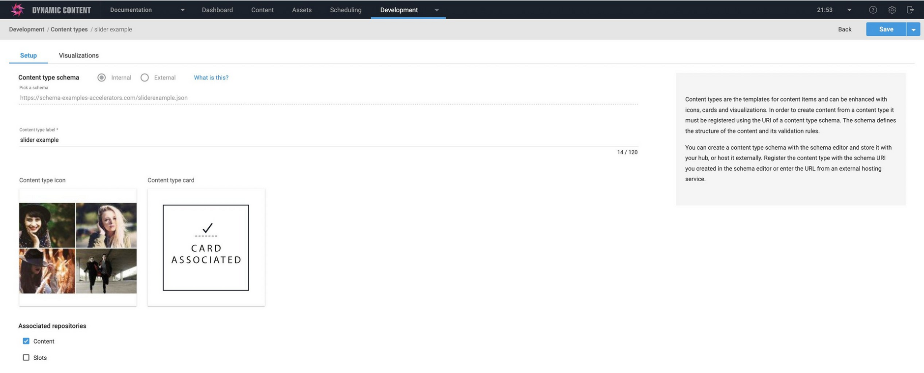
In the example below, the content type already has an associated icon and card.
Updating a content type cardLink copied!
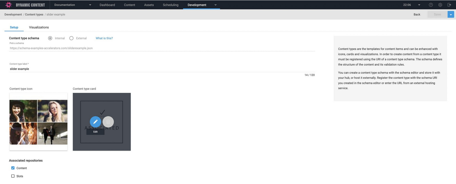
To update the card used for this type, hover over the card icon and click the pencil icon to open it for editing.
The card details already set up for this content type are shown.
You can then choose another of the standard cards or you might want to enter the URL for your own card. In this case the Summary photo card was used and we want to use the Photo card instead. To do this we choose the photo card and map the image it displays to the background property of the banner content type. Click the "Save" button at the top of the window to apply the changes.
The changes will be applied and in this case content created using the Feature banner type will now be represented by the Photo card when shown in the Content Library.
Syncing a content type with its schemaLink copied!
If you make a change to a content type schema and that schema has already been used to register a content type, you need to ensure that the content type is "synced" with the schema so that it is using the latest version.
If you make changes to a content type schema you should consider how the changes affect the way existing content is viewed and edited. This page provides some guidelines.
Choosing a content type to sync with its schemaLink copied!
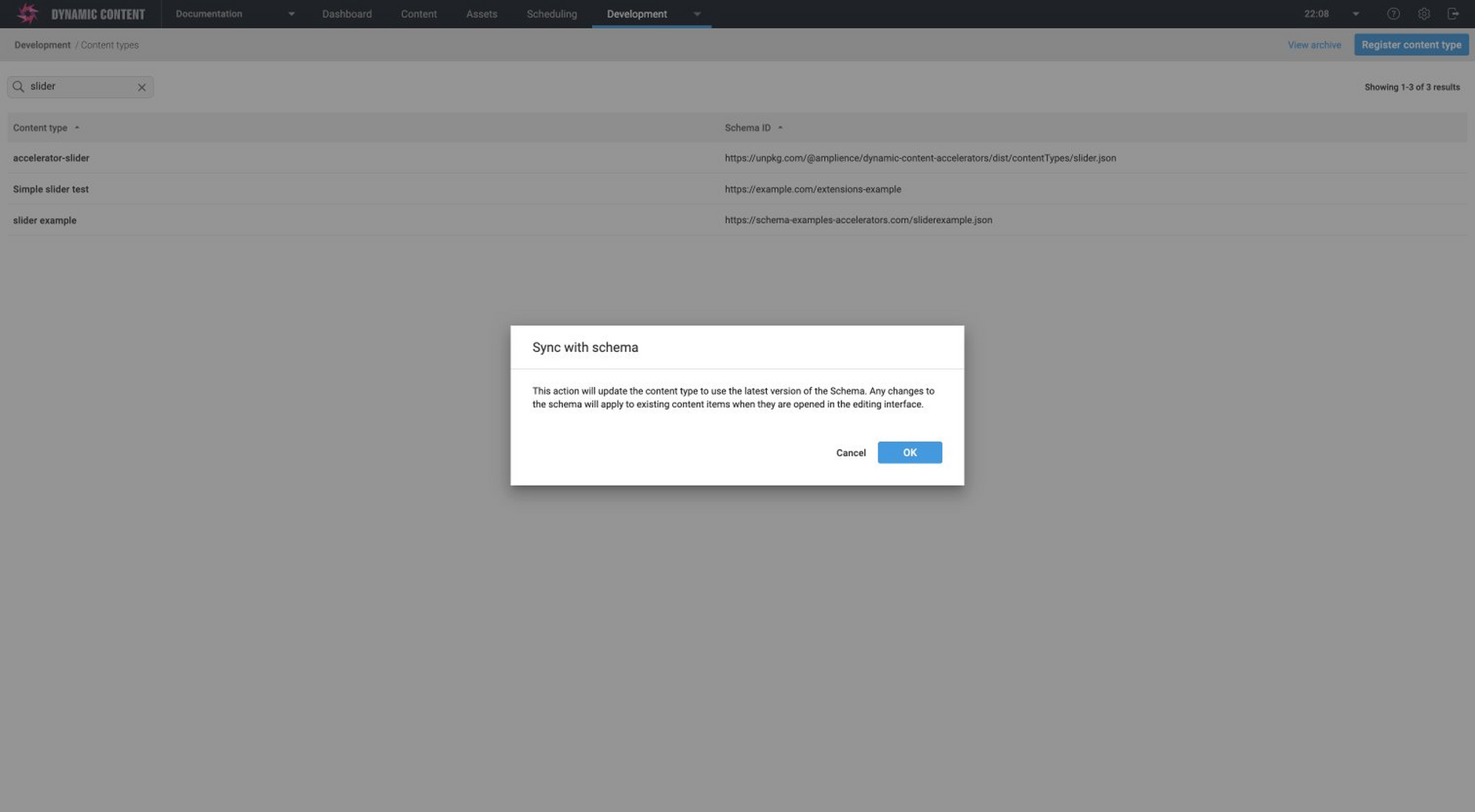
To sync a content type with its schema, view the content types window by choosing "Content types" from the Development tab and select "Sync with schema" from the contextual menu of the content type that you want to update.
A warning dialog will be displayed to inform you that any changes you make will apply to existing content when viewed in the content form. See the Guidelines for making a change to a content type schema section on this page for more details of how any changes you make may affect existing content.
Click the "Ok" button to go ahead and sync the content type with the updated schema. If the updated content type is valid JSON schema, a success message will be displayed.
If the updated content type is not valid JSON schema, then an error will be displayed. In this case you'll need to identify the problem with the JSON schema, upload the content type to the hosting service and sync it again. If the schema has been created using the schema editor and stored internally, then you can open it from the content type schema window.
Syncing a schema from the schema editorLink copied!
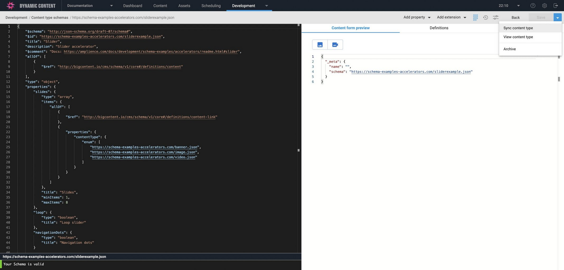
You can also sync a content type schema with its content type from the schema editor window.
With your content type schema open in the schema editor, choose "Save and sync content type" from the Save menu (or "Sync content type" if you've already saved the updated schema).
Syncing the schema works in the same way as it does when choose "Sync with schema" from the content types window. You'll be a shown a dialog to warn you that any changes you make may affect existing content. Once you accept this dialog, the schema will be synced with the content type.
Guidelines for making changes to a content typeLink copied!
If you update a content type schema that has been used in a registered content type from which content has been created, changing the name, type or validation defined for a property will require users to enter new values for the updated properties when editing existing content.
Content published using the previous version of the content type schema can still be consumed, but if the content is edited and then re-published, you may need to update your front end rendering code.
The following sections explain the various changes you can make to content type schemas and the impact each type of change has on existing content.
Changing a property nameLink copied!
- Dynamic Content will treat the renamed property as a new property and data entered for the property under its previous name will be lost.
- When editing existing content, the renamed property will be initially empty. The user will need to enter new data for property and save the content.
- For content published using the previous version of the content type, the property will be available under its old name until the user re-saves and publishes the content.
- You will need to modify your front end rendering code to consume content with the renamed property.
Changing a property title and descriptionLink copied!
- The content label and explanatory text are shown in the content form and will not affect the structure of the content.
Adding a new propertyLink copied!
- Existing content will not be effected
- You may choose to change the
propertyOrderwhen updating the content type. - You may also need to update your front end rendering code to include the new property.
Removing a propertyLink copied!
- When viewing existing content, the property will no longer be visible in the content form.
- Existing published content will continue to serve the old property until it is saved and re-published.
Changing a property typeLink copied!
- Dynamic Content will treat this as a new property and any data entered for the property under its old name will be lost.
- When editing existing content, the renamed property will be initially empty. The user will need to enter new data for property and save the content.
- Changing the property type also includes changing it into a localizable content type.
Changing Validation on a propertyLink copied!
- No changes the way existing content is viewed
- If a previously entered value for this property is no longer valid, then it must be updated to be valid before the content can be saved.
Archiving content typesLink copied!
To help manage the content type list, you can move content types that you no longer wish to work with to a separate archive.
Archived content types are not shown in the "Choose a content type" window in the Content Library and so are not available to create new content items. However, existing content items and slots will not be effected and can be edited, published and added to slots in editions as normal.
Archiving and unarchiving a content typeLink copied!
To archive a content type, choose "Archive" from its menu in the content type list. To open the archive window, choose "View archive" at the top of the content types window.
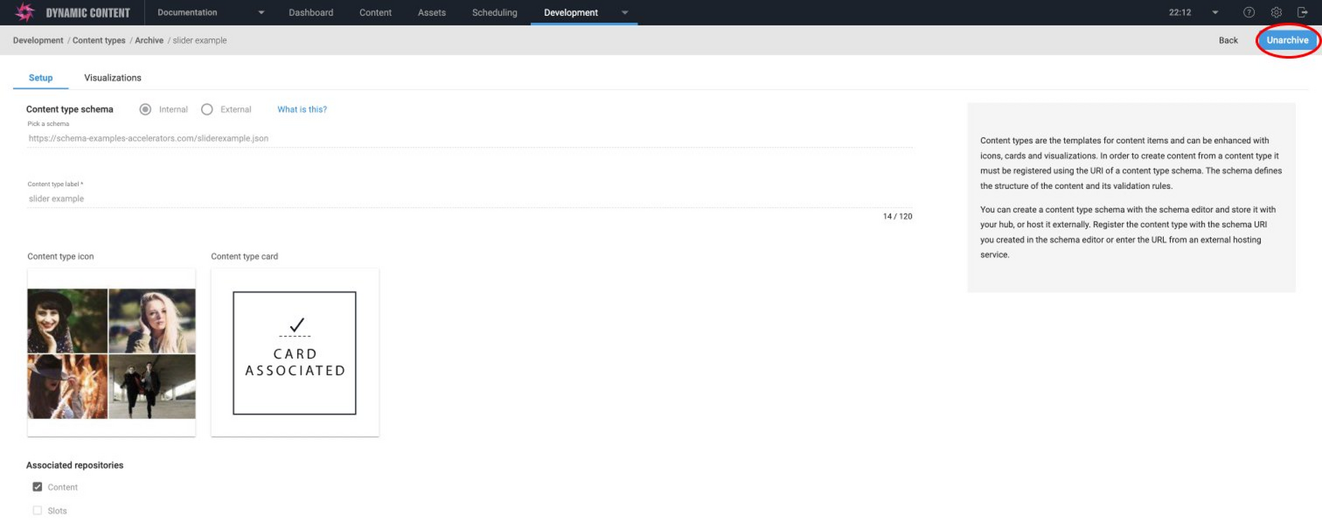
The content type will be moved to the archive window. From here you can unarchive the content type to move it back to the content type list.
When you open the content type registration window for an archived content type, it will be displayed in read only mode. You can choose to unarchive the content type by clicking the "Unarchive" button, as highlighted in the image below.
Viewing content created from an archived content typeLink copied!
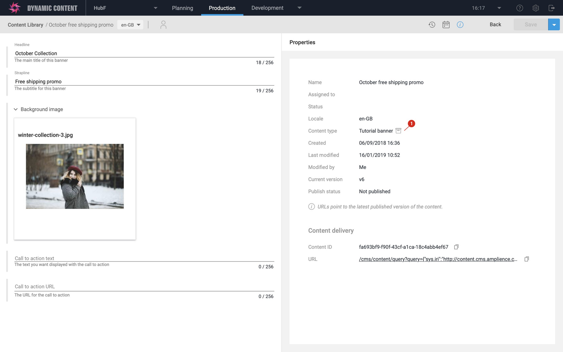
When you view content created from a content type that has subsequently been archived, an archive icon will be shown in the Content Library, either in the content item's card or next to the content type entry in the list view, as shown below.
The archive icon will also be shown when viewing content item properties.
The archive icon is also shown next to archived slots in the slot library when you add a slot to an edition in the scheduling view.
