Arrays and objects
This page contains the parameters for structural input field components — used for properties of type object and array, plus the code editor and hidden-property patterns.
For the shared "ui:component" syntax used across all input components, see Specifying property component parameters.
Try the interactive examples on this page
Edit the schemas to see how your changes affect the fields they generate.
ArraysLink copied!
A list component with additional support for flexible lists of multiple types of content.
ParametersLink copied!
| Parameter | Description |
|---|---|
| collapsed | true or false (default). Is the property initially collapsed? This takes priority over default behaviour and the user setting for content. |
| withChildHeaders | true or false (default). Set to true to hide the top level headers in the array |
| icons | Icons displayed in the selection menu for the content palette |
Supported iconsLink copied!
The following icon names are available for use in the selection menu of content palettes. Icons are from the Tabler Icons library — search that library by name to preview an icon before using it.
article, blockquote, carousel-horizontal, carousel-vertical, clock-hour-11, code, color-swatch, columns-2, columns-3, container, device-mobile, device-laptop, device-tablet, float-right, float-left, heading, html, layout, layout-bottombar, layout-grid, link, list, list-numbers, map-plus, music, numbers, photo-plus, plus, section, seo, separator, share, slideshow, square-plus, table-plus, template, text-caption, text-plus, typography, video-plus
Example: array without child headersLink copied!
Schema source
Example: array with content paletteLink copied!
The following example shows a flexible list of content (a content palette) with text and banner objects. We've included params to configure the icons used for each object in the content palette menu selector. The icons map to the value of the const in the type property defined in each object.
If there are 3 or fewer items defined in the array then the user selects content using buttons, while more than 3 items are shown in a menu with the icons that you specify.
See the content palette schema reference and schema examples for more details.
Schema source
ObjectsLink copied!
For complex properties that contain other properties, you can decide to hide the header, the title and description, to reduce the amount of space the property takes up.
You can also choose to set an object to be initially collapsed.
ParametersLink copied!
| Parameter | Description |
|---|---|
| collapsed | true or false (default). Is the property initially collapsed? This takes priority over default behaviour and the user setting for content. |
| withHeader | true (default) or false. Is the title and description shown for the top level item |
Example: a collapsible objectLink copied!
Schema source
MatrixLink copied!
The matrix component displays an array property as a table of rows and columns — a spreadsheet-style editing view that makes it convenient for users to enter structured, repeating data. Use a matrix in your content type schema to model content such as an FAQ, a size guide, a buyer's guide or a product comparison table.
To add a matrix to a schema, set the component name to matrix on an array property and define a columns array, as shown in the example below.
The properties stored in the columns of a matrix are scalar data types: number, integer, string and boolean, as well as rich text, images and video. You cannot add content links, content references, objects, localized values, or any property that uses an extension.
ParametersLink copied!
| Parameter | Type | Description |
|---|---|---|
name | string | matrix |
columns | array | The name and properties of each column |
Columns arrayLink copied!
| Parameter | Type | Description |
|---|---|---|
pointer | string | A JSON pointer reference to the property to be shown in this column. For example: "/questions" |
title | string | Optional. The name of the column. If this is not included then the column number will be shown |
width | integer | The width of the column in pixels. The minimum column width is 140px |
Note that the maximum row height is 175px without scrolling.
Example: an FAQ matrix schemaLink copied!
This schema creates a matrix with two columns, "Questions" and "Answers", where each row of the table is one FAQ entry. The pointer of each column references a property defined in the array's items.
Schema source
Media cardLink copied!
The media card is used to display images and video with a title, description and optional alt text for images.
ParametersLink copied!
| Parameter | Description |
|---|---|
| withAltText | For images only. Should alt text metadata be shown on the card. true (default) or false. |
Example: an image without alt textLink copied!
The example shows an image property configured with alt text turned off. By default alt text will be turned on. You only need to specify the altText param if you don't want the alt text icon to be shown on the media card.
Schema source
Localized value setLink copied!
This component allows you to choose the locales that are shown for a property. It is designed for use with field level localized properties.
Note that if the user filters out one of the pinned locales then a message will be displayed that a pinned property is hidden.
If you set useRepoDrivenLocales then the locales assigned to a repository are initially shown for a property. If this parameter is set and there are no locales assigned to a repository, then the pinned locales will be used instead.
ParametersLink copied!
| Parameter | Description |
|---|---|
| name | localized-value-set |
| pinnedLocales | An array of locales that are initially shown for a property (eg en-US, fr-FR). Users may choose additional locales, but the pinned locales cannot be removed |
| useRepoDrivenLocales | true or false (default). Set to true to pin the locales initially shown for a property rather than those defined in pinnedLocales. This requires Repository locales to be set. |
| withHeader | true (default) or false. Is the title and description shown for the top level item |
Example: localized value with pinned localesLink copied!
This example shows the use of the localized value set component. This component is used with field level localized properties and allows you to specify the locales that are shown by default for each property.
Using the component with a localized property helps improve the authoring experience if you have multiple locales on your hub and only want to view and add values for certain locales.
In this example there are localized string, image and list properties. We have used the pinnedLocales param to show the en-GB and fr-FR locales by default for each property. The user can choose to view additional locales.
If one of the pinned locales is hidden, using the locale filter at the top of the screen, then a message will be displayed.
Example content formLink copied!
In this example there are 7 locales available on the hub, but only the pinned locales: en-GB and fr-FR, are shown by default.
Code editorLink copied!
The code editor is attached to properties of type string. It allows you to add an editable text field formatted for a range of languages including JavaScript, JSON and HTML.
You can specify validation and set it to read only, as well as setting some default text.
ParametersLink copied!
| Parameter | Description |
|---|---|
| name | code-editor |
| language | The language to use for formatting. html (default), css, json, javascript, typescript, jsx or tsx |
Example: a string formatted as HTMLLink copied!
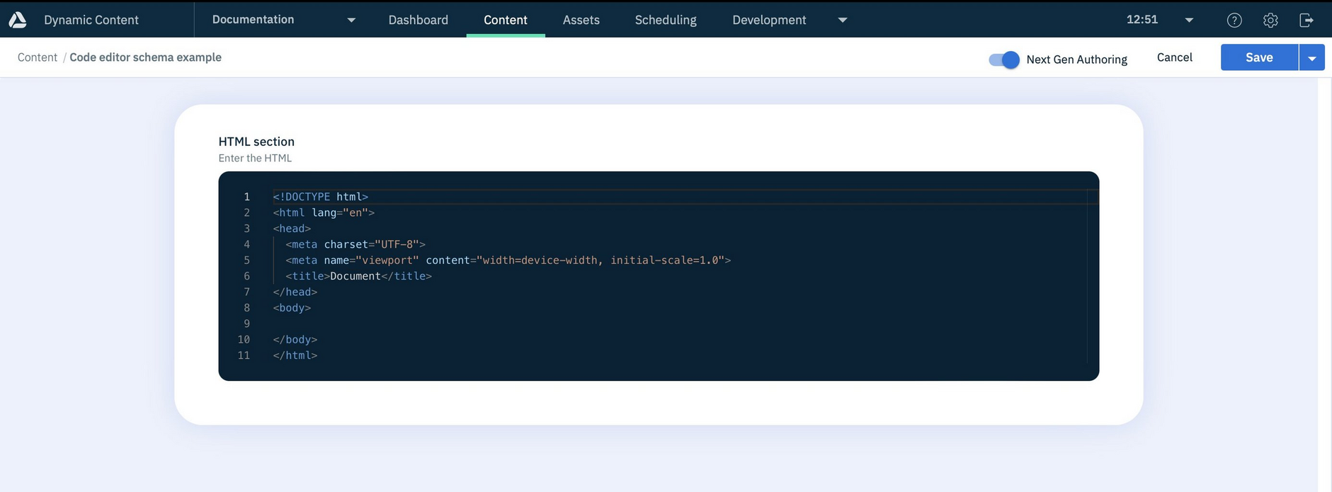
This example shows a property htmlsection with some default text, formatted for html.
Example content formLink copied!
The image below shows an example content form created from the code editor example schema.
In the example some default HTML text has been added to the field which can then be edited by the user.
Hidden propertiesLink copied!
You can add ui:component: "none" to a property to hide it from the user so it's not shown on the content form. Hidden properties can be const values, or updated using the Content Management API rather than from the content form.
If a value is set for a hidden property it will be shown in the JSON output for a content item, but it will not be displayed in the content form.
Example: a hidden string propertyLink copied!
Hidden properties- usage notes
-
Properties with no value set will not be included in the JSON output for a content item
-
Be careful of listing this property as
required. Users could end up not being able to save their content form but with no indication as to why. This could happen if developers update the content item using the Content Management API while users are updating the content item in the content form.