Choice of color formats, for example, rgb
Optimize your authoring experience
Your authoring processes should let you create content efficiently and effectively, without the distraction of unnecessary clutter and steps. With Amplience, developers can use our content authoring features to optimize the way you create content.
How to include these features
The example enhancements and customization described here require your developers to make changes to your system.
Browse the examples below for ways to optimize the authoring experience.
Organize layoutsLink copied!
Arrange layouts in a way that makes it simple to find information.
-
Tabs let you organize information into logical sections, for example based on task, persona or output, so you can quickly find what you need for those last-minute edits
-
Grids help to align fields side by side, to group related fields and create more compact forms
-
Dividers visually separate sections in your forms, enhancing clarity and organization during content editing without altering the final content
For some examples of tabs and grids, watch the video below.
Simplify displaysLink copied!
Make content authoring easier by showing and allowing what's needed when certain conditions are met.
You can use conditions with any input or action for showing and allowing content fields.
Reduce the number of forms you have
Multiple forms with similar functions can be combined into one, flexible form with the help of conditions.
This video gives a quick overview of how conditions can make your authoring experience easier, and we’ve included more details for you below.
Show what's necessaryLink copied!
Displaying fields only when they're necessary, and hiding them otherwise, helps to focus on what's important and keep your forms compact.
Example 1: Display more detail when a date is enteredLink copied!
This example demonstrates using a date as a conditional field. Once the Publish date is selected, additional publishing fields are displayed for more detail to be entered.
Example 2: Display more detail when text is enteredLink copied!
With this example, a condition is set on a text field. Entering a SVG file name expands the form to show the width, height and margins parameters.
Example 3: Display more detail when a value is selected from a listLink copied!
In this example, a condition is set for a specific value in a list. The list includes a range of common aspect ratios and a "Custom" ratio. Choosing the "Custom" ratio displays additional options for width and height.
Show what's availableLink copied!
Displaying all the available options for content, and only allowing what's relevant, gives a clear view of the choices while only allowing them to be used when needed.
In this example, a condition is set to enable fields when a specific list value is selected. The width and height fields are always displayed but can only be populated when a "Custom" ratio is selected.
Switch to relevantLink copied!
Conditional fields can help to keep things simple by switching which content is displayed based on your input or selection.
This example, shows banner content that can display either a video or an image. Switching between image and video displays relevant fields for the chosen media.
Interested in this feature?
Ask your developers about using conditional fields to drive your content creation process.
Customize input fieldsLink copied!
One of the best strategies for optimizing your authoring experience is to customize input fields so you can create content with minimum effort. With our customizable controls your developers can tailor fields such as color pickers to support the way you want to work.
Here are examples of some of the input fields that can be customized.
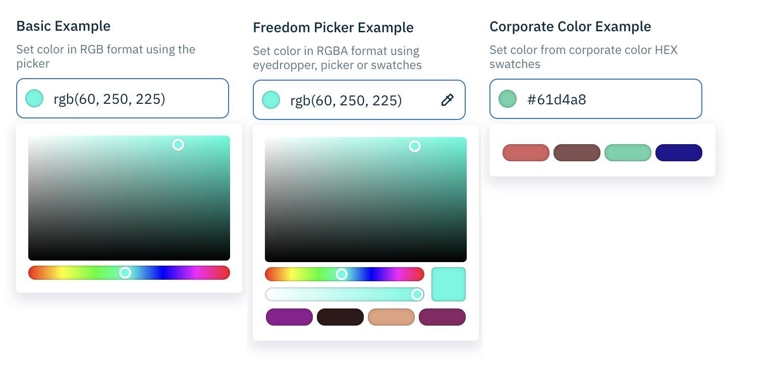
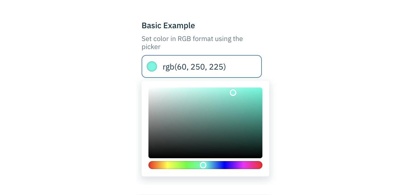
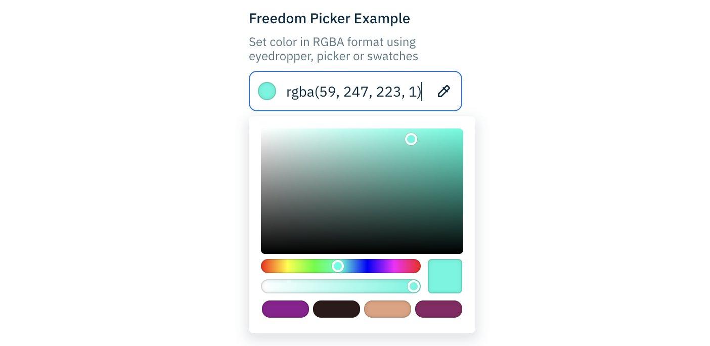
Example color pickersLink copied!
Color pickers can be customized to adjust the level of flexibility you have when setting colors.
Below are some examples of customized color pickers:
- Basic color picker for setting any colors
- Freedom color picker for setting any colors and includes brand colors in a color swatch
- Brand color picker for limiting colors to maintain a consistent color palette
Color value formatsLink copied!
Color values can be shown in your preferred format, for example Hex, RGB or RGBA.
Color picker eyedropperLink copied!
The eyedropper lets you quickly grab colors from other resources and add them to your content. Simply click the eyedropper, then click on the color you want to use.
Example slider controlsLink copied!
Quickly set values for your content with slider controls that show what's allowed 'at a glance'. Wherever you have a choice from multiple options within a limited range you may want to use sliders.
Example slider for simple either/or valuesLink copied!
Sliders can be used to represent simple decisions, such as whether or not a page should be indexed for SEO purposes.

Example slider for a range of valuesLink copied!
Here it's easy to see the range of discounts that can be applied for a sale, and that discounts outside of this range are not allowed.

Example slider for a range of friendly valuesLink copied!
Creating content is simpler with values that are user-friendly, removing the need for guesswork. In this case, the gradient settings are labeled ranging from "Transparent" to "Solid" instead of using percentages.

Friendly field valuesLink copied!
Easy to understand field values can help avoid confusion and using incorrect values by mistake. Avoid having confusing default system values in drop-down lists by asking your developers to swap them with more user-friendly labels.
For example, instead of showing the HTML value _blank for opening content in browser windows, your developers set the more meaningful value 'Open in a new window or tab'.
Interested in this feature?
Ask your developers to replace default system values with user-friendly values in dropdown lists.
Use flexible authoringLink copied!
There are various ways to model and create content. An approach that gives content authors flexibility is to include content palettes in content types.
Content palettes allow authors to mix and match elements, such as, text, images, or videos in any order they want within a content item. This is especially useful for pages with unique content, for example, corporate pages, blogs and news articles, where a strict template isn't necessary.

Content palettes simplify creating content by removing the need to piece together separate content items, letting you focus on what you want to tell your audience.
Here are some benefits of using content palettes:
- You'll need fewer content types because content palettes allow you to build up content the way you want
- Creating and managing content becomes easier when there are fewer content types to understand and navigate
- Authors gain freedom to be creative when creating content while still following style guides
how are content palettes different to using linked content items?
The inline content you create with a content palette is used only in the context of its parent content item, and can't be reused separately.
When to use content palettesLink copied!
You can use content palettes whenever you like, but they are most suited for use with unique, long form content that contains different formatting and structure within the same page.
A few examples of when content palettes are useful are:
- Corporate pages, such as Terms and Conditions, Policies and Accessibility
- Blogs, where you want each of the posts in the blog section on your website, to follow your standards without being restricted to a specific template
- News articles where you use the same types of content, like headings, text, videos, images and quotes, in different sequences within different articles
Example: simple content paletteLink copied!
In the example below, a content palette is being used to create a blog page that consists of Rich Text, Images and Links.
We'll start by using the "Rich Text block" to create a heading and some text.

tip
Our example content palette is set up to allow 3 item types, and has a button for each. Content palettes that allow more than 3 item types have a single "Pick an item" button.
Now our example has an opening paragraph, so we'll add an image.

It's as simple as that. Simply keep adding elements of content that are allowed by the content palette, in any sequence you want.
Rearrange your content
As you build up the content in a palette you can rearrange it until it's in the order you want. See Arranging nested content.
Example: inline and linked contentLink copied!
Content palettes can be set up to include both inline and linked content, giving you even more flexibility.
In this example, the content palette is set up with a number of items for creating blog content. We've placed a promotional video at the top of the blog, followed by a heading with an introductory paragraph. These items are inline content.
We want to use this blog post to promote products, and we can do this easily by using the "Content link" item to add links to our existing product content.

Using the content palette, our blog can be expanded with more inline text, headings and videos, alongside existing content items that are included by adding links to them.
Interested in this feature?
Ask your developers to configure your content types to include content palettes.
Apply image alt textLink copied!
If your system is set up to automatically generate alternative text for images, the image alt text fields can be automatically populated with those descriptions (from the image metadata).
To access image alt text hover over the media card and select "ALT". If there are multiple alt text descriptions, you can choose the locale you want to use in your content. Note, updating alt text from within content, saves the updated alt text with the content and doesn't update the image alt text metadata. More about Automatically generated alt text.
