Snippets of these configurable components can be added to your schemas to create a tailored content authoring experience.
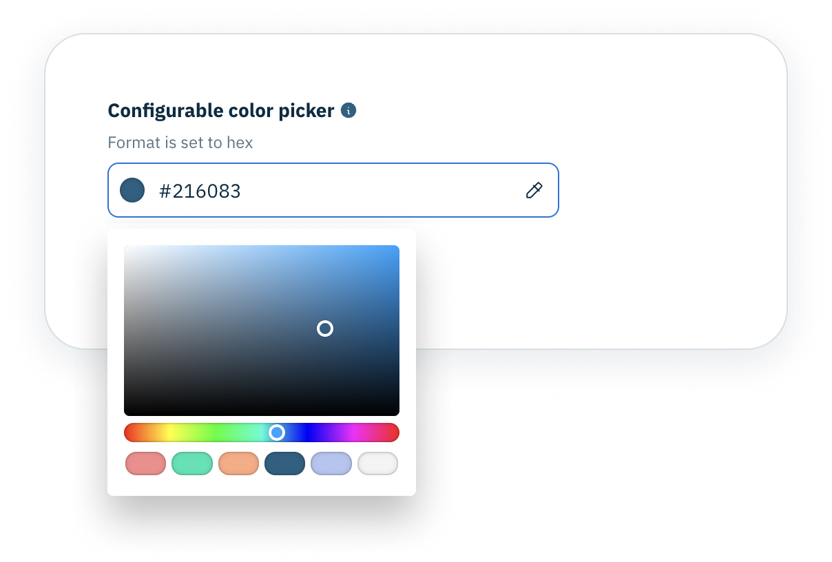
Configurable color picker
- Can be used with a property of type
string and format color
- Take colors of either
hex or RGBA, with hex being the default
- Array of colors displayed as swatches in color picker
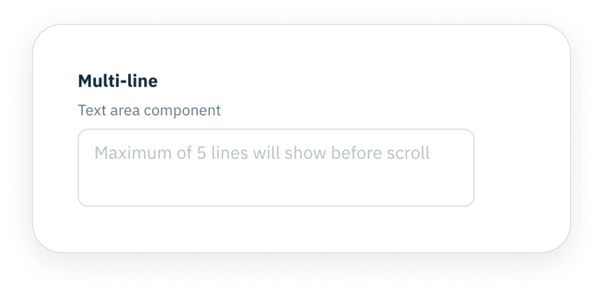
Multi-line text area
- Renders single or multi-line text
- Choose whether text area should grow with content
- Specify number of rows using minRow and maxRow
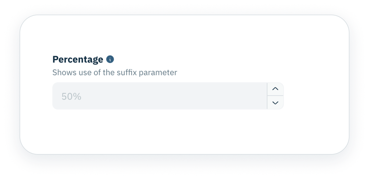
Integers and numbers
- Choose between components of type
integer or number
- Displayed through an editable text box with arrows
- Use negative numbers, add suffixes and more
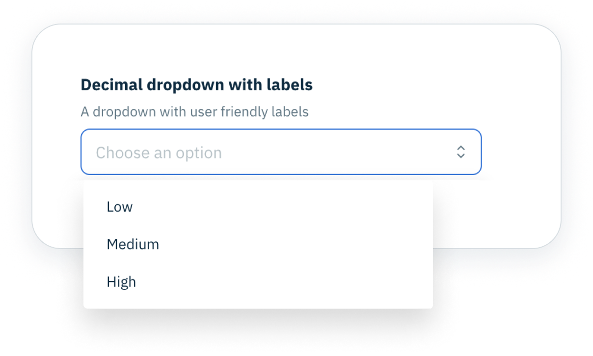
Droplist with labels
- Shows a list of labels and values
- Populated using the
oneOf keyword
- Used with
string, integer and number
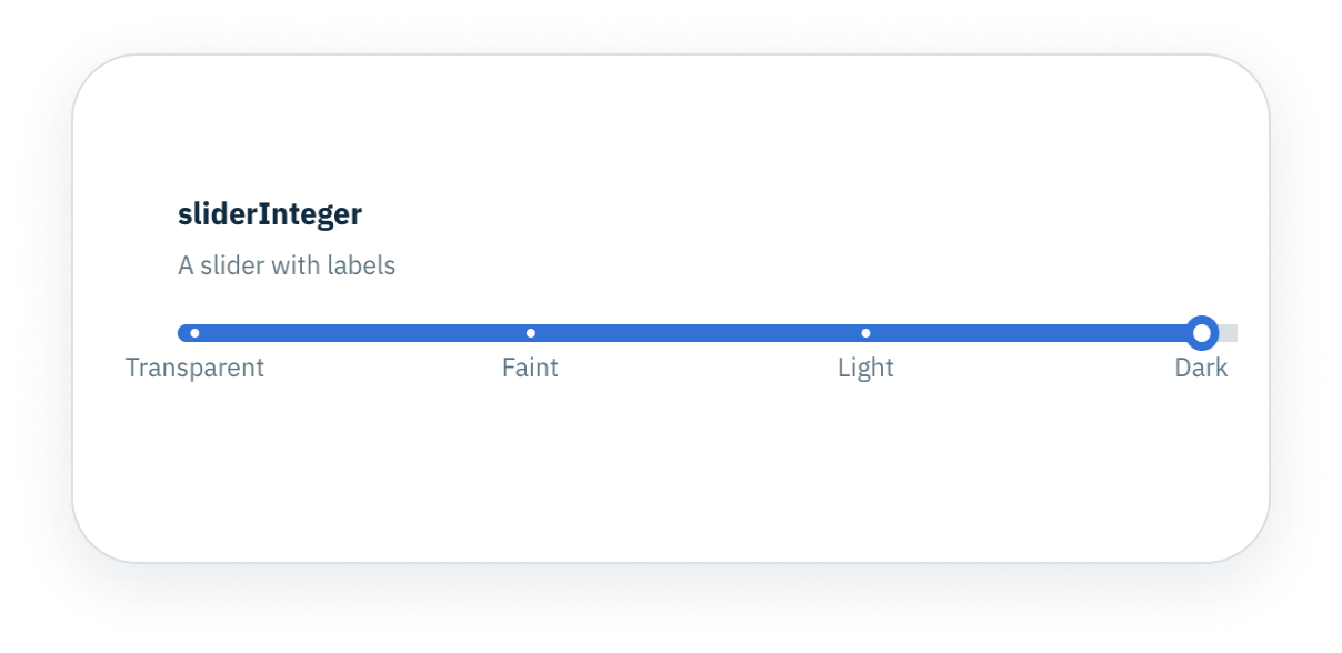
Configurable slider
- Used with properties of type
integer or type number
- Marks displayed in array of
value and label
- Inverted parameter set to
true or false
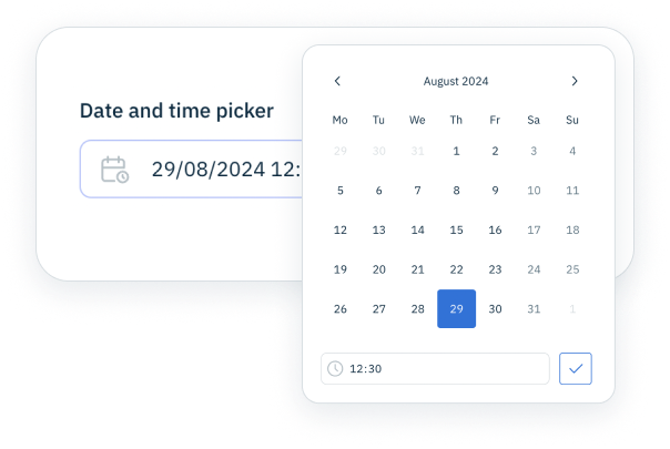
Date and time picker
- Used with property type
string and format date-time
- Placeholder text can be specified
- Represents user selectable date and time
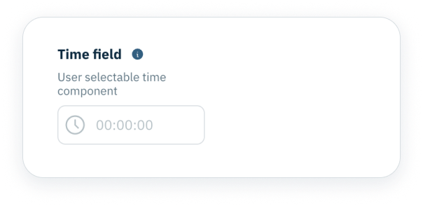
Time input
- Represents a user selectable time
- Used with property type
string and format time
- Cursor pointer can be shown using
true or false
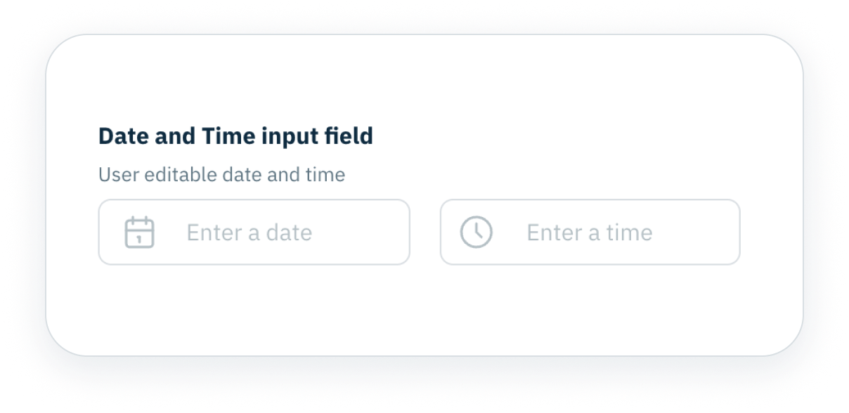
Date and time input
- Used with the
date-time-input property type
- Users can enter a date and time using edit fields
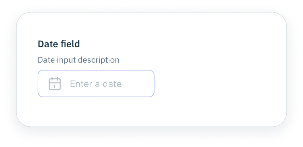
Date picker
- Used with a property of type
string and format date
- Date format can be defined
- Placeholder text can be specified
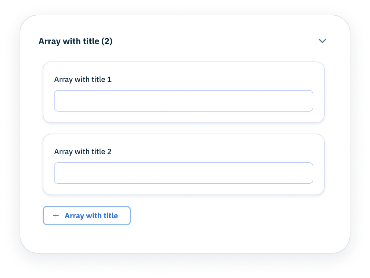
Arrays and objects
- Reduce amount of space object takes up by hiding properties
- Opt to set array or object to be initially collapsed
- Define a content palette of multiple types of objects
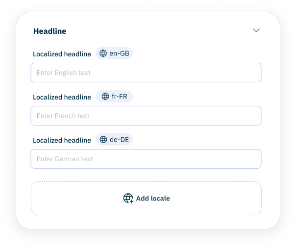
Localized value set
- Designed for use with field level localized properties
- Specify the locales that are shown by default for a property
- Users can choose to add further locales
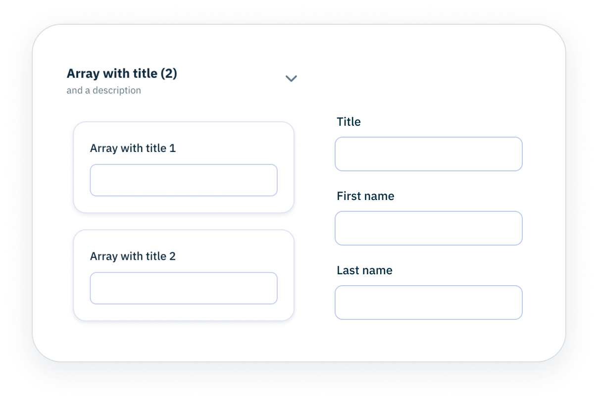
Grid layout
- Allows you to group related properties in columns
- Use parameters like the
columns to specify how columns are displayed
- Each item in
columns includes a span and pointers array
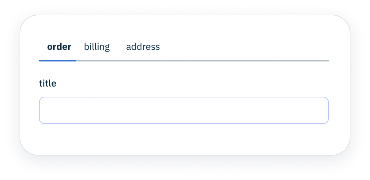
Tabs layout
- Organise your form so it can be navigated using tabs
- Specify tab labels, default tab and properties
- Tabs can also be configured to show vertically